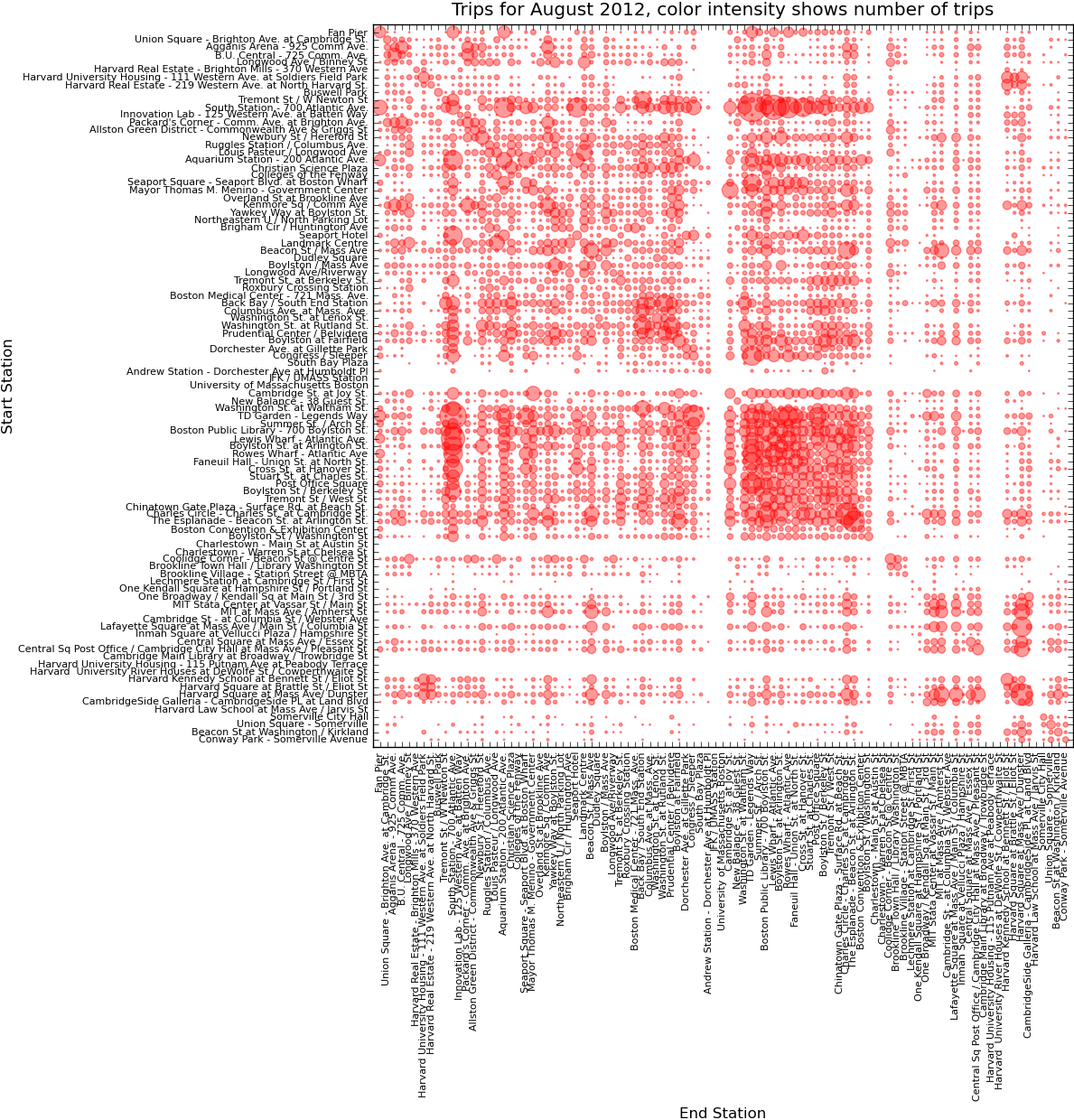
I took a closer look at the Hubway trips data for August 2012 data (busiest month on record with average of nearly 3,000 trips per day) and was surprised that almost all stations were connected by some trips. Also with clear clustering for TD Garden (North Station) and South Station, Harvard and the diagonal representing round-trip rentals. Other symmetry on the diagonal likely representing commuters going from one destination to another and back again later. The cluster on the diagonal over the whole data set highlights the 6.93% of trips which return to the same location.
 This figure was generated with matplotlib and data processed in python. Unused stations were likely not opened yet in August.

Hi,
Could you please describe what commands you used to get the plot? It looks really cool, but I can’t seem to find anything similar in the gallery (http://matplotlib.org/gallery.html).
Cheers,
Michael
Hi Michael! Glad you enjoyed this plot. It was some fun data for me to work with and this was my first go at visualizing it.
There are a couple simple pieces to making this work:
1) The individual data points are drawn with the “scatter”, where x, y are obviously the coordinates and s is the size of the dot. I also used an alpha value to have some transparency to accommodate overlapping data, for example:
pyplot.scatter([x],[y], s= [z], color = c, alpha = 0.4)Note I was plotting one point at a time, hence the [x] etc instead of just ‘x’ if your data was in an array already.
2) In order to get a matrix like layout, with (0,0) in the upper-left, I reversed the y values and labels when plotting them. I also set the axis range just outside the data that was plotted so it looked cleaner.
Due to the data I was using and the form I processed it in the code may be a little funky for your purposes, but I cleaned it up to a relatively small demo, which I’m sure you could adapt. Here is some imaginary data of Rock-Paper-Scissors versus my husband and the full code example for plotting Rock-Paper-Scissors Matrix:
Enjoy!
Zia