Monthly Archives: July 2013

Making the Tree Map more organic (non-uniform column widths) and testing some other data sets

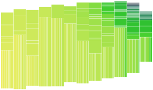
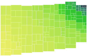
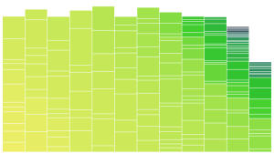
Continuing the work on the Color Prioritized Tree Map, I implemented variable column widths as a step towards making the tree map look more organic. The top picture here is uniform widths for reference and the one below introduced some variable widths, specifically I used a widths multiplier array of [2,3,4,2,5], which is then wrapped to apply a multiplier to the width of each column. This means the second column is 50% wider than the first etc.

variableColWidths

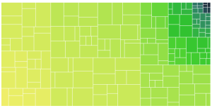
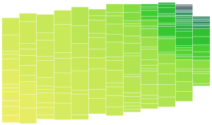
The column widths are assigned before the data is binned, the bin sizes are now equal height instead of equal area. Below is another example. Based on initial testing, the variable widths improve the image best when tweaked and evaluated by eye (since the data set and number of columns also affect the resulting shape). Overall, variable column widths were not as big a gain as I was hoping. Also since the columns are centered on a diagonal, the stepping appearance is retained. I guess introducing variable height would help! But I think the better approach is to look into ragged edges first.

variableColumnWidths

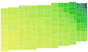
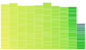
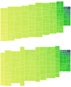
I also tested out a few other data sets, these ones are really lumpy:

lumpy_data

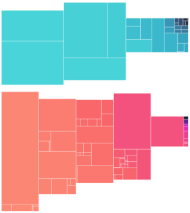
I am still not sure what sort of data will be representative for the target application, but these data sets did stress the viz a bit and demonstrated that the following suspected issues are real:

  • Very small areas erased by a white border: The border is implemented by subtracting a “margin” value from the desired length and width of each element and may result in invisible cells for very small areas. In practice these are so small as to be virtually invisible before, but I modified the code to not apply the white space if it will erase the data point for now.
  • Bad data in the form of missing fields crashes the viz: This is corrected now handled by silently rejecting those data points.
  • Giant elements overflow the column and go off the top of the user provided SVG: Elements with area greater than what should be in a column get put in a column anyway, in which case, the tree map can go off the top of the SVG. It probably makes sense to have some guidelines regarding number of columns based on the size of the largest data and the distribution. A related improvement would be to verify that we aren’t drawing outside the designated box and scaling everything down appropriately if we are to ensure we stay on the user provided SVG.

Tree Data Structure for Color Prioritized Tree Map Project

Continuing the color prioritized treemap project, I built an appropriate tree data structure, where each Node represents either

  • a leaf
  • a group of Nodes (horizontal groups constrained to have the same width and vertical groups to share height)

Important methods include:

  • getArea() which returns the total area for all children
  • createSubGroups() which performs the grouping on this node’s node-group (creating the tree), and
  • flatten() which takes the start coordinates of lower left corner and height or width constraint and recursively flattens the tree, returning a list of boxes with fully defined coordinates appropriate for d3 rendering of the tree map.

To retain the overall organic shape, the highest level is represented as separate columns, each as a vertical node group (if these columns together were considered a horizontal group, the overall shape would be square). I restructured the previous example to use my new data structure. The following screen shot demonstrates that horizontal and vertical grouping is working, as well as the rendering code. As a basic test I simply grouped the first 6 Nodes in the column into a horizontal group:

horizontal_grouping_works

The overall shape here is unchanged from before, you can see that the order of Nodes (defined by the gradient) is retained.

Next up: working on the algorithm for which Nodes to group and how, and thus create a pleasing shape. :)

The following screen shot shows some great improvements and some simplification of the approach too. Now for each column, the elements are grouped into a tree structure, where the smallest area node in a group is paired with the smaller of its neighbors (building a tree of fairly balanced area at each level). Now when flattening the tree, the node groups are assigned either vertical or horizontal orientation based on which will give the better aspect ratio for the sub-groups based on the dimensions of the block being filled. This is the data now with 8 columns:

AdjacentGroup8Cols

It seems to be shaping up nicely, but would be good to fray the edges and vary the column widths to mask the columns better (as Mark Schindler noted, they imply a structure to the data that is not there).

For curiosity’s sake, here is the same data with only one column. What looks kinda like 3 columns here is an artifact of the grouping algorithm (at each level the data is divided in groups), data set and svg aspect ratio:

AdjacentGroup1Col

Now, it’s time to try out a few different data sets and see what other issues shake out.

Creating a color prioritized treemap with GroupVisual.io

I am doing some work now with Mark Schindler of GroupVisual.io. He recently presented at a DataViz meetup about his ideas and motivation for a more intuitive treemap variant. I am going to give a shot at creating it. Here is an example of the color-prioritized treemap concept:

Essentially, this layout abandons the traditional category groupings in a treemap in favor of a more pleasing organization based on the same metric used for color. The other challenges will be creating a pleasing organic shape approximating the hand designed one above. The target is to do this in javascript/d3 for use in web apps.

My first pass approach is to sort the elements based on the color metric, then toss them in bins (columns) of approximately equal area and render it using a stacked bar chart concept using d3:

stacked_bar_v1

It’s a start. Next step, make the columns a bit more equal and fill them on a diagonal, to get a better controlled gradient. In the following screen shot the working area was divided into a grid and filled from the bottom left to the top right on the diagonal. For example, a 3×3 grid is filled in the following order:

4 7 9
2 5 8
1 3 6

Still has the problem that the first column will be full and the last one most likely not, as each preceding column is slightly overfilled.

diagnoal_bins

The following shows a first step at fixing the balance issue, simply centering each column vertically along a slight diagonal for a bit more pleasing shape:

centerOnDiag

That’s it for baby steps, next up: time to work on squaring up these little sliver rectangles and become more “tree” like.