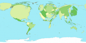
I am working on a Cartogram of the World with my friend Kim Ducharme. We are looking for something dramatic to show disparity between affluent countries and developing countries and a cartogram seems a great way to hit the message home. This is my first foray in to the world of cartograms, so here is some useful background.
A cartogram is a map where the areas of regions have been adjusted to represent some other metric of interest. They are intentionally distorted “maps” and yes there is controversy over them :).
Cartograms come in a few different flavors (see indiemaps summary):
- Non-contiguous Cartograms: Each object (state/country/etc) grows or shrinks independently of its neighbors. With the result being perfectly accurate, but the original map is filled with white space. Excellent history of Non-contiguous cartograms here.
- Dolring Cartograms: Replace the regions with circles or squares I won’t discuss these more.
- Contiguous Cartograms: Attempts to keep boundaries connected and distorts the shapes (often grossly) attempting to scale the country areas according to some metric. The canonical approach seems to be the Gastner/Newman diffusion method.
Having decided to pursue generating a contiguous area cartogram, first step was to find out how.
Selecting a Cartogram program:
There are a few options I found for generating a contiguous area cartogram:
- Download the source for Gastner/Newman’s cart program, compile and run it. Looks doable, but would need to massage my data into some grid format. Maybe someone else has made it easier…
- Apparently ArcGIS has a Cartogram Geoprocessing Tool based on the Gastner/Newman method too. But I don’t have a budget for fancy commercial software.
- ScapeToad: At last, a ready to go cartogram generating program also based on the Gastner/Newman method. This one has a GUI and is released under the GPL. Perfect!
Using ScapeToad to generate a cartogram:
Using ScapeToad is easy! It has simple instructions and I only ran it a few issues easy to work around. It uses ESRI shapefiles and will output the updated image as an ESRI shapefile (with error data added in). I also found the ScapeToad documentation pretty helpful. The only annoying issue on my system was the recently used files selection silently didn’t work. So when opening a shapefile (via “Add Layer…”) I had to always browse to the correct location. I will discuss about the “Mass” and “Density” options in another post. Otherwise there is not much to say, I will let ScapeToad speak for itself.
ScapeToad requires the shape file to have “perfect contiguity”, so find a suitable shapefile and test it before moving on. As discussed in a previous post, the Natural Earth shapefiles are now my go to. These files conveniently have some population data you can use to test the ScapeToad is working.
More on the real challenges, adding your own data to a shapefile, coming up…

