Click on the image below to see the full resolution image of my submission to the Hubway Data Challenge (which is huge and should be made into a poster, it’s the only reasonable way to view it, sorry!) The explanation of the graphic is included below. Do you like it? Check out this and the other visualizations. This entry was 16th in the popular vote of 67 entries. Not bad for a days work!
Hubway Station Connectivity Matrix

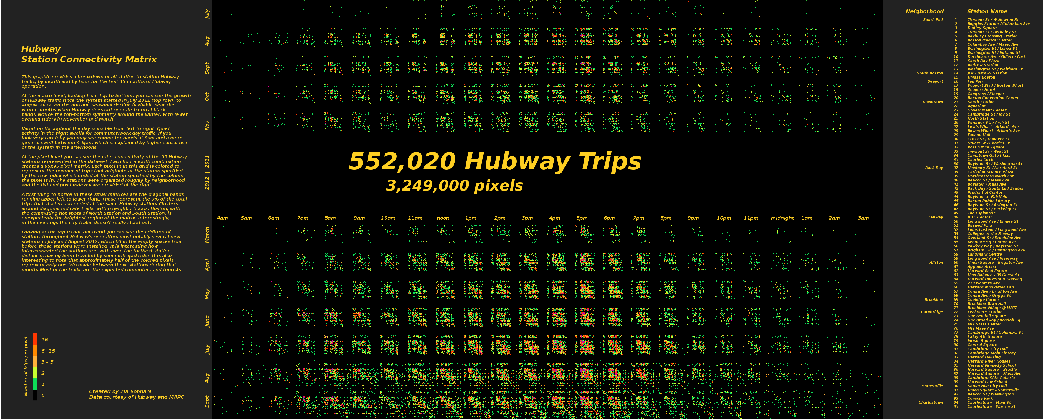
This graphic provides a breakdown of all station to station Hubway traffic, by month and by hour for the first 15 months of Hubway operation.
At the macro level, looking from top to bottom, you can see the growth of Hubway traffic since the system started in July 2011 (top row), to August 2012, on the bottom. Seasonal decline is visible near the winter months when Hubway does not operate (central black band). Notice the top-bottom symmetry around the winter, with fewer evening riders in November and March.
Variation throughout the day is visible from left to right. Quiet activity in the night swells for commuter/work day traffic. If you look very carefully you may see commuter bands at 8am and a more general swell between 4-6pm, which is explained by higher causal use of the system in the afternoons.
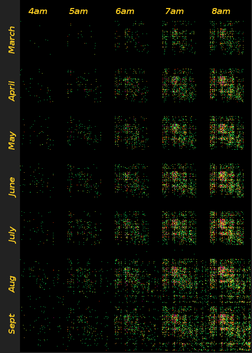
At the pixel level you can see the inter-connectivity of the 95 Hubway stations represented in the data-set. Each hour/month combination creates a 95×95 pixel matrix. Each pixel in this grid is colored to represent the number of trips that originate at the station specified by the row index which ended at the station specified by the column the pixel is in. The stations were organized roughly by neighborhood and the list and pixel indexes are provided at the right.
A first thing to notice in these small matrices are the diagonal bands running upper left to lower right. These represent the 7% of the total trips that started and ended at the same Hubway station. Clusters around diagonal indicate traffic within neighborhoods. Boston, with the commuting hot spots of North Station and South Station, is unsurprisingly the brightest region of the matrix. Interestingly, in the evenings the city traffic doesn’t really stand out.

Looking at the top to bottom trend you can see the addition of stations throughout Hubway’s operation, most notably several new stations in July and August 2012, which fill in the empty spaces from before those stations were installed. It is interesting how interconnected the stations are, with even the furthest station distances having been traveled by some intrepid rider. It is also interesting to note that approximately half of the colored pixels represent only one trip made between those stations during that month. Most of the traffic are the expected commuters and tourists.
How I made it
This visualization is based on the station connectivity matrix images I had generated earlier when looking at the Hubway data. Several people thought they were interesting, but I struggled with how to capture the trends, should I do an animation? Something with slider bars where they could move either forward by month or by hour? There are so many stations it is really hard to label them on a plot and it looks all lop-sided and imbalanced. Also the matrix really flattens the relationship between the station locations, but also trying to put it on a map is just a mess as well (although some people have done some great things in the Hubway Visualizaton Challenge, you should check it out.
Hubway extended their deadline and our team submission was nearly complete so I decided to see what I could do to visualize this data I had gathered in 24 hours before the deadline. First I made a web page, was planning to throw in some slider bars and tooltips/mouse over information to provide the data and highlight station names. That was going okay. One of the problem is that this is really a large amount of data, each plot has nearly 10,000 data points and I wanted to show the breakdown by hour within each month. Decent looking .pngs were too big. I spent some time thinking about how to store and transmit the data.
Then I took a mini break and finished re-reading Tufte’s Data Visualization book, where I was reminded of the idea of small multiples as a way of presenting data. Whew! Could I do that?
Okay, I created a web page with small multiples (back to my novice web layout nightmares of flowing images). The png’s at 1″x1″ were looking pretty bad.
Next I tried to generate an .svg with the data from one matrix and then see if I could composite them together. Just one crashed Inkscape. It’s a lot of data and a lot of little vector circles! Although I liked the number of trips being represented by circles, the sheer magnitude of the data pretty much ruled that out.
So a pixel map it is. Then I started getting super excited, I could align the matrices so that a new one starts every 100 pixels and then the legend would be in the pixel location! In the end I didn’t like the visual padding between the matrices and so they are at 95 pixel intervals, corresponding to the 95 stations.
I ended up generating the main image using the Python Imaging Library, since my data was all in python already it was extremely easy! I then added the text and legend with the GIMP. I spent an inordinate amount of time trying out different color schemes and wasn’t really happy with any of them. This data distribution is very non-linear. 1/2 of the colored pixels represent 1 trip. This is definitely an area worth more study.
I am super excited about how many of the trends we know about were visible in this graphic. I am also excited about the amount of real underlying data I was able to include. Unfortunately the image is huge. But maybe I will have a poster made to celebrate my first visualization entry of all time.
Errata
The pixel count is too high, I removed the data from October 2012 for which there was incomplete data and including it was visually confusing and misleading in terms of the trends, but forgot to update the numbers.
The legend doesn’t include all of the colors used, I struggled with trying to find a color scheme that was pleasing and also conveyed the hot spots. I conclude it is hard to illustrate hot spots with only one pixel, magenta and purple pixels all count into the red category of very high traffic. A handful of pixels represent over 100 trips in the specified month/hour.
ToDo’s
I would like to try grouping stations by popularity within neighborhoods. I suspect with this change some neighborhoods would be easier to identify and provide a better “legend” of sorts.
Learn a vector drawing package and render the text in a vector form.
Correct issues above, perhaps tweak the color scheme some more or try grayscale.
Rotate month axis markers to be horizontal and adjust paragraph width on description and generally perfect the layout.
