I decided to document the tooltip approach I’ve used on some recent projects. Basically a combination of the styling approach as seen in the New York Times article: Four Ways to Slice Obama’s 2013 Budget Proposal (this is a wonderful visualization I’ve studied a lot) and David Walsh’s css triangles trick for the call out triangle. It is a common enough need to have a tooltip with some styling and a nice indicator arrow pointing at my data, something like this:
HTML
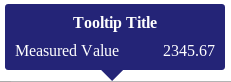
First, define the div structure for the tooltip and classes to be used, with some text for testing the layout. It helps to have a high level container for positioning and then individual classes to format different fields. In this example I used a couple of spans to have left and right justified text for the data display. I usually just put the tooltip div in the body in html (rather than generate it programmatically):
<div id ="tooltipContainer">
  <div class="tooltipTitle">Tooltip Title</div>
  <div class="tooltipContentsContainer">
    <div class="tooltipMetricContainer">
      <span class="tooltipMetricName">Measured Value</span>
      <span class="tooltipMetricValue">2345.67</span>
    </div>
  </div>
  <div class="tooltipTail-down"></div>
</div>
CSS
Next up, style the tooltip! I usually set the #tooltipContainer to “display: block” when testing so I can see how the tooltip renders with the dummy data. I often use crazy colors to debug as well (it can be helpful to see exactly where the triangle div overlaps the main part of the tooltip for example). Here is the css used to generate the example tooltip above:
/* Overall container for the tooltip */
#tooltipContainer{
    position: absolute;
    display: block;
    background: midnightblue;
    color: white;
    border-radius: 3px;
    padding: 10px;
    width: 200px;
    opacity: 0.95;
}
.tooltipTitle{
    font-weight: bold;
    text-align: center;
    margin-bottom: 10px;
}
.tooltipMetricName{
    float: left;
}
.tooltipMetricValue{
    float: right;
}
.tooltipTail-down{
    /* position down arrow relative to the #tooltipContainer */
    position: absolute;
    bottom: -11px;
    left: 95px;

    /* Render a triangle of ccs pointing down as discussed here:
       http://davidwalsh.name/css-triangles */
    width: 0;
    height: 0;
    border-right: 12px solid transparent;  /* left arrow slant */
    border-left: 12px solid transparent; /* right arrow slant */
    border-top: 12px solid midnightblue; /* bottom, add background color here */
    font-size: 0;
    line-height: 0;
}
Now you should have something like this rendering on your page:
Javascript
Now that you have a dummy tooltip rendering, it is time to make it interactive using javascript to accomplish the following:
- Control display of the tooltip (togging display between “none” and “block”, or fade in using transitions on opacity),
- Populate data values for the different fields you are displaying, and
- Position the tooltip (relative to the cursor or positioned over an svg element)
Positioning relative to the cursor
Here are the relevant bits of code (note I am using d3 and jquery), positioning the tooltip relative to the cursor.
// store reference to tooltip to avoid looking it up all the time
var simpleTooltip = d3.selectAll("#tooltipContainer")
.style("opacity", 0); // hide it since we are done testing now
// define a function to update the tooltip
function updateTooltip(d, displayRequested){
if(!displayRequested){
// hide the tooltip
simpleTooltip.style("opacity", 0); // #1 hide on mouseout
}else{ // show the tooltip
// #2 Populate display based on input data (d)
// set the data to display for each field of the tooltip
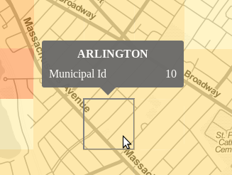
simpleTooltip
.select(".tooltipTitle").text(d.properties.municipal);
var mc = simpleTooltip.selectAll(".tooltipMetricContainer");
mc.select(".tooltipMetricName").text("Municipal Id");
mc.select(".tooltipMetricValue").text(d.properties.muni_id);
// #3 Position the Tooltip, here relative to the mouse
// get the tooltip dimensions dynamically if the size could change
var h = $("#tooltipContainer").height();
var w = $("#tooltipContainer").width();
// center the tail dynamically
simpleTooltip.select(".tooltipTail-down")
.style("left", (w/2 - 29/2) + "px");
// position with respect to mouse on mouseover
var offsets = {"x": d3.event.pageX, "y": d3.event.pageY };
simpleTooltip
.style("left", ( offsets.x - w/2) + "px")
.style("top", ( offsets.y - h -36) + "px"); // fudge factor 36
// #1 Display the updated tooltip
simpleTooltip.style("opacity", 0.95);
}
}
// add mouse event listeners to your features, which call the update function
features
.on("mouseover", function(d){
updateTooltip(d, true);
})
.on("mouseout", function(d){
updateTooltip(d, false);
});
Positioning the tooltip with Javascript relative to SVG element
There are two cases I’ve used for positioning the tooltip, either using page coordinates, or svg coordinates. The former, shown above, is best for adding a tooltip on a path (for example a data line), where you want the tooltip to be where the mouse is mousing over the line. The latter approach (svg coordinates), is best when you want to position the tooltip relative to the element you are mousing over, for example, directly above or to the right of an svg:circle.
In the case of an svg circle for example, you can add an argument to pass the element into the update function and calculate the offset coordinates as follows, NOTE in this case the tooltip div is declared inside the SVG (is that crazy, whatever, it works):
function getOffsetsForSVGCircleOrRect(el){
    var h = $("#dataTooltip").height();
    var w = $("#dataTooltip").width();

    if(el.attr("cx")){
        // it is a circle data point
        var xpos = Number(el.attr('cx'))+margin.left;
        var ypos = Number(el.attr('cy'))+margin.top + Number(el.attr('r'));
    }else{
        // assume it is a rectangle
        var h = Number(el.attr("height"));
	var w = Number(el.attr("width"));
        var xpos = Number(el.attr('x')) + w/2 + margin.left;
        var ypos = Number(el.attr('y')) + h   + margin.top;
    }
    return {"x":xpos, "y": ypos};
}

// update function for some circles, which passes the element (d3.select(this))
points.enter().append("svg:circle")
    .attr("class", "point")
    .attr("r", 10)
    .attr("cx", dx)
    .attr("cy", dy)
    .attr("fill", getColor)
    .on("mouseover", function(d){ enableDataTooltip(d, d3.select(this), true); })
    .on("mouseout",  function(d){ enableDataTooltip(d, null, false); })
That’s the idea anyway. There are so many ways to approach tooltips. I just wanted to share what is working for me at the moment. This approach works well if you don’t want a drop shadow on the tooltip, if you want a border of some sort, then you can use an image instead of the css triangle as was done in the NYT article mentioned above.

thank you, this helped me tremendously.
Glad to hear it!