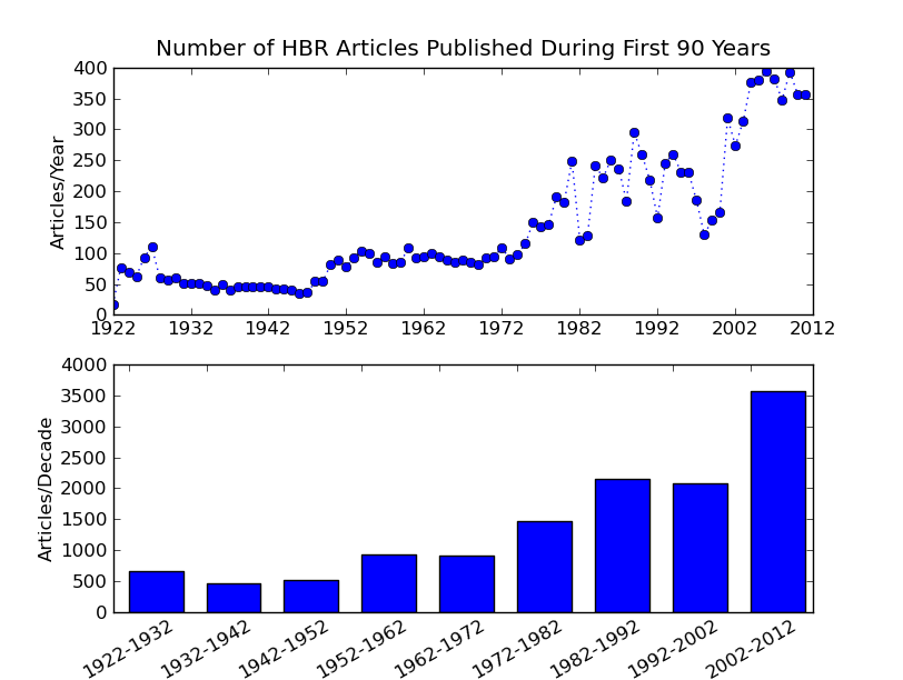
I reworked the previous data using python’s CSV library, which was embarassingly easy and saved much time over dealing with escaped quotes and commas by hand. ![]() I also used matplotlib for the first time. For the most part I like it since I can leverage my knowledge of MATLAB plotting. It is also really nice to use list comprehensions to generate labels.
I also used matplotlib for the first time. For the most part I like it since I can leverage my knowledge of MATLAB plotting. It is also really nice to use list comprehensions to generate labels.
It only took a moment to find the documentation for custom labels (if you already know ‘xticks’ it makes it easy to find!), b is the starting value for each range and the following labels the binned data in the bar graph.
pyplot.xticks(b,[str(bi)+’-‘ +str(bi+10) for bi in b], rotation =30)

