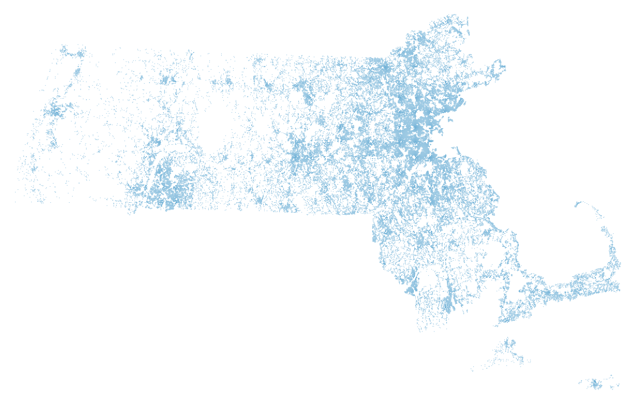
MAPC provided a shape file dividing the state on a 250m grid (~15 acre blocks). The file is pretty unwieldy, dividing the state into 355,728 segments, for which only 67,919 have data (less than 20% of the grids have a metric for “mipdaybest” which I used to filter the data). Here is a picture of the state with only the grids with data colored:
To accomplish this rudimentary image I converted the provided shape file to GeoJSON in python using the pyshp library, filtering out records with no data. This code is based on an example by M. Laloux, modified to use an iterator over the records and drop any with no data (here I am using “mipday_phh” as a proxy for no data).
import shapefile
import itertools
import sys
sourceName = sys.argv[1] #"../data/grid_250m_attr.shp"
destName = sys.argv[2]   #"data/grid_250m_attr_removedEmpty.json"

# read the shapefile
reader = shapefile.Reader(sourceName)
fields = reader.fields[1:]
field_names = [field[0] for field in fields]

mipday_phh = field_names.index("mipday_phh")

buffer = []

for (sr, ss) in itertools.izip(reader.iterRecords(), reader.iterShapes()):

    if sr[mipday_phh] == 0.0:
        #print "skipping", sr
        continue
    atr = dict(zip(field_names, sr))
    geom = ss.__geo_interface__
    buffer.append(dict(type="Feature", geometry=geom, properties=atr))

    # write the GeoJSON file
from json import dumps
geojson = open(destName, "w")
geojson.write(dumps({"type": "FeatureCollection","features": buffer}, indent=2) + "\n")
geojson.close()
I then opened the file in QGIS (Why did I convert it to GeoJSON you ask? Because I am planning to work with it in d3 next). With QGIS I can’t see the grid color by default because it is overwhelmed by the default black border on each shape. This post discusses how to remove the outline. I ended up using the last option (the old Symbology), but what a pain!
Besides the difficulty of working with such large files (did I mention with all the yak shaving I am doing here I got a bigger hard drive too?). The grid data is also awkward to link to other data sets, which more typically use zip code information. (Update: The companion data set Tabular section includes zip code information for the centroid of each grid cell). Since the grids are regular, many span multiple zip codes/municipalities. Furthermore, addresses were mapped to grid locations based on estimates of street location, so for some rural areas some data was mapped to the wrong grids etc. Regardless of those challenges, the pictures below show clearly that driving patterns vary greatly within a city or zip code.
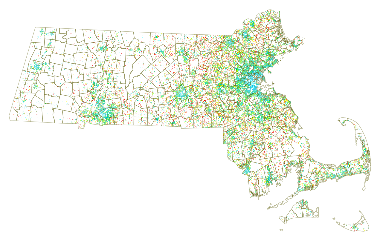
Here are a few plots looking at the data in QGIS showing Miles Per Day per Household, where the blues are under 35 miles per day, yellow around 75 and orange is over 100 miles per day. It’s a horrible viz, but I can’t bring myself to spend time on the color config in QGIS (way too painful). Note the municipality boundaries shown are drawn from a separate shapefile layer provided by MAPC.
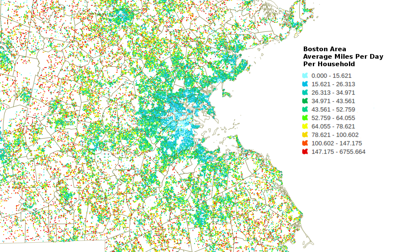
The same image is shown below zoomed in on the Boston area. There are unsurprising large swaths of long distance car commuter communities ringing the city. I included a legend here FWIW, the colors were picked manually from the QGIS color picker (which leaves a bit to be desired), hence the abysmal scheme. The divisions were automatic using the equal bin option. This data is clearly flawed! We can see from the legend that there is at least one grid cell with an average of over 6 thousand miles a day! I screen grabbed this legend from the layers toolbar in QGIS and gimp-shopped it in for your viewing pleasure.
Next up, working on a workflow for rendering nice images and figuring out what data and stories to tell.
Data used in this post was provided by Vehicle Census of Massachusetts, Metropolitan Area Planning Council 2014 and licensed under a Creative Commons Attribution 4.0 License.


