Author Archives: Zia

Reading HTML with Python

Today I read some HTML data from a table using Python. The tools I ended up using to get the data were:

import urllib
f = urllib.urlopen(<URL_string>)
# Read from the object, storing the page's contents in 's'.
s = f.read()
f.close()

Then to parse tables in the HTML I used lxml which can read HTML and provide an ElementTree like API.

from lxml import etree
html = etree.HTML(s)

I was then able to do everything I needed using list() on the element to get the children and using the attributes .text and .tag to get the text out of tables and links as desired.

Putting data on a map

Here is my first plot of some data on a map. This happens to be the locations of seismic monitoring stations around the world.

I used a equirectangular projection of the world map from wikipedia, which means that lat/long coordinates map easily to pixel coordinates. Also used the python csv library to read the data and the python imaging library to modify the image with red dots for monitoring station locations.

“Somewhat unlikely” results?

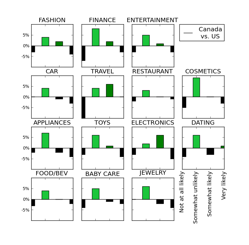
As shown yesterday, the US and Canada have very similar reported expectations for future purchases based on online reviews etc. In fact, in most cases the difference between their reports is under 5%. However, I noticed one interesting trend. It seems Canadians are consistently more likely to report a “Somewhat unlikely” prediction. Confusing? I think so too and suspect that as Americans we are uncomfortable with the terminology “Somewhat unlikely” and therefore avoid selecting that option. At least this is one theory. I suspect this is not significant data, but more “likely” a linguistic issue.

The figure below shows the difference between Canadian and US reporting, in EVERY category, more Canadians reported “Somewhat unlikely”. With the exception of the TRAVEL and ELECTRONICS categories,  the “Somewhat unlikely” response (lightest green) differed more than any other.

Difference of Canadian and US Response to forecasted purchases based on online media by category

Conclusion: American’s are somewhat less likely than Canadians to select “Somewhat unlikely” for predictions.

The Economist-Nielsen Data Visualization Challenge

I started looking at the data for The Economist-Nielsen Data Visualization Challenge. It includes survey responses from 30+ countries for questions pertaining to consumer confidence.

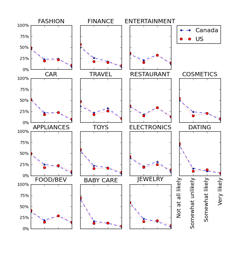
Regarding the role of social media and use of internet reviews, the following question was asked in 14 categories: “In the next year, how likely are you to make a purchase based on social media websites/online product reviews for each of the following products/services?” Valid responses were ‘Very likely’,’Somewhat likely’,’Somewhat unlikely’,’Not at all likely’.

The categories are abbreviated in the graphic below which shows that the North American countries surveyed (US and Canada) track very closely in response.

Likelihood of Purchase in Next Year Based on Social Media or Online Review

Stay tuned till tomorrow and I will let you know why I think this data is amusing.

Python CSV library and matplotlib

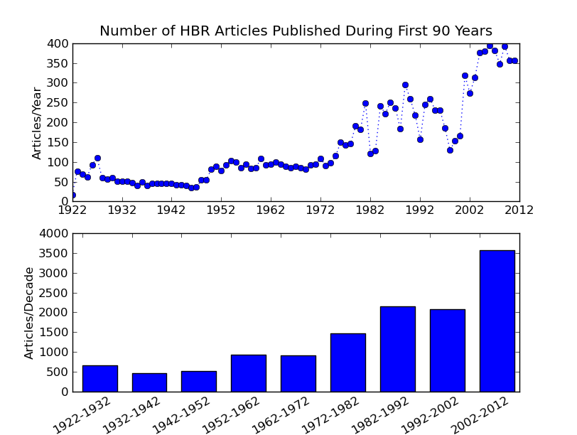
I reworked the previous data using python’s CSV library, which was embarassingly easy and saved much time over dealing with escaped quotes and commas by hand. :) I also used matplotlib for the first time. For the most part I like it since I can leverage my knowledge of MATLAB plotting. It is also really nice to use list comprehensions to generate labels.

It only took a moment to find the documentation for custom labels (if you already know ‘xticks’ it makes it easy to find!), b is the starting value for each range and the following labels the binned data in the bar graph.

pyplot.xticks(b,[str(bi)+’-‘ +str(bi+10) for bi in b], rotation =30)

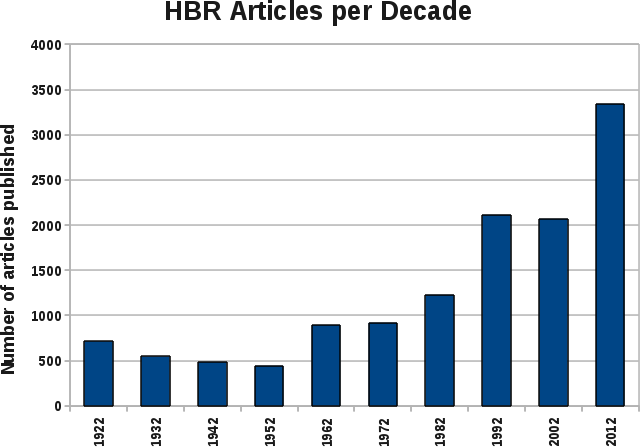
So… The reveal, my first plot of data for the Kaggle Harvard Business Review Competition.

I am not going to put words to explain that I am very embarrassed, but I think that’s the point. I’ve massaged the data provided by the Harvard Business Review on articles they have written in the last 90 years, ignoring the interesting data like the titles and abstracts text.

I used python to process this data and then plotted it in OpenOffice. Clearly the *beginning* of something.

The Beginning of the Middle?

So I am looking for a job… I do a search on Data Visualization Boston trying to find some company I saw a few years ago that I thought looked cool, building data visualization tools, what was their name? Instead I find the Boston Data Vis meetup, which is having their first meeting in months TONIGHT. Humm… Sister visiting from Africa… hang out with her tonight, or go to the meetup? I go to the meetup. Very cool. Now child-like excited about a new field. At moments TERRIFIED because what skills does an embedded software developer have that are relevant to data vis? Well, still excited, so here begins a journey.

Definitely starting in the middle.