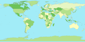
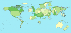
Say I want my output map of the world to be colored with a customer specified set of specific colors for countries, water etc. I also want to output a specific resolution for publication.
Natural Earth shapfiles have a the built in “mapcolor” attribute to group countries appropriately for this purpose, that will be helpful!
Q-GIS has some nice functionality for playing around with the shapefile and exploring the data. But for a final output image it doesn’t meet the following requirements:
- Controlling output image resolution and cropping (you can save to .png or .jpg, but there are no other options regarding resolution or dimensions to save).
- Configuring colors and color ranges to use can be done (quick and dirty demonstration that the mapcolors attribute is what I expect is easy). But using Q-GIS quickly becomes a super manual process, you have to specify colors via separate RGB fields, ugh. You can specify an attribute to use for the color categories, but seems hard in that mode to configure specific colors to use.
- Must reload modified shapefiles and re-configure them anytime the source file changes.
I don’t doubt that there are plugins for saving files (say if you want a vector image!!) and I could probably create my own symbology configuration for the colors I want, but since I am only catering to myself and don’t want to become an expert in some RSI inducing graphical interface… time to find a scriptable way to generate high quality output images.
Mapnik is a map renderer that has bindings for lots of languages including python. I started with Getting started with mapnik in python, which walks through a simple example in no time. First problem solved: simply specify the image size when you declare the map:
m = mapnik.Map(600,300)
And specify the area you want to display when you save it:
m.zoom_to_box(mapnik.Box2d(-180, -90, 180, 90)) # or m.zoom_all()
mapnik.render_to_file(m,'world.png', 'png')
Unfortunately, coloring the country groups is not trivial. Mapnik doesn’t current have the ability to set the PolygonSymbolizer’s fill color based on a shapefile attribute (feature in the works). However, as I am now an expert at manipulating shapefiles with pyshp, I hacked together an ugly but straightforward solution in a few minutes.
- Using pyshp, read in the shapefile to render and spit out n new files, one for each mapcolor group. See split_mapColors.py
- Create a unique mapnik style for each country color group and add each new shapefile to the map with the appropriate style layer. See renderCommon.py
Using the same techniques morphed shapefiles can be rendered in the same color pallet, change your mind about the colors? No problem.


