Tag Archives: pyshp

Using Mapnik to render custom colored Map images

Say I want my output map of the world to be colored with a customer specified set of specific colors for countries, water etc.  I also want to output a specific resolution for publication.

Map of World rendered in Mapnik

Natural Earth shapfiles have a the built in “mapcolor” attribute to group countries appropriately for this purpose, that will be helpful!

Q-GIS has some nice functionality for playing around with the shapefile and exploring the data. But for a final output image it doesn’t meet the following requirements:

  • Controlling output image resolution and cropping (you can save to .png or .jpg, but there are no other options regarding resolution or dimensions to save).
  • Configuring colors and color ranges to use can be done (quick and dirty demonstration that the mapcolors attribute is what I expect is easy). But using Q-GIS quickly becomes a super manual process, you have to specify colors via separate RGB fields, ugh. You can specify an attribute to use for the color categories, but seems hard in that mode to configure specific colors to use.
  • Must reload modified shapefiles and re-configure them anytime the source file changes.

I don’t doubt that there are plugins for saving files (say if you want a vector image!!) and I could probably create my own symbology configuration for the colors I want, but since I am only catering to myself and don’t want to become an expert in some RSI inducing graphical interface… time to find a scriptable way to generate high quality output images.

Mapnik is a map renderer that has bindings for lots of languages including python. I started with Getting started with mapnik in python, which walks through a simple example in no time. First problem solved: simply specify the image size when you declare the map:

m = mapnik.Map(600,300)

And specify the area you want to display when you save it:

m.zoom_to_box(mapnik.Box2d(-180, -90, 180, 90)) # or m.zoom_all()  
mapnik.render_to_file(m,'world.png', 'png')

Unfortunately, coloring the country groups is not trivial. Mapnik doesn’t current have the ability to set the PolygonSymbolizer’s fill color based on a shapefile attribute (feature in the works). However, as I am now an expert at manipulating shapefiles with pyshp, I hacked together an ugly but straightforward solution in a few minutes.

  1. Using pyshp, read in the shapefile to render and spit out n new files, one for each mapcolor group. See split_mapColors.py
  2. Create a unique mapnik style for each country color group and add each new shapefile to the map with the appropriate style layer. See renderCommon.py
Putting it all together, I used the script renderBaseline.py and other utility functions to generate the colored map of the world above. 

Using the same techniques morphed shapefiles can be rendered in the same color pallet, change your mind about  the colors? No problem.

Generating a cartogram of access to pain medication around the world.

Okay! Now that I have my data in a shiny new shapefile. Time to make some cartograms using ScapeToad.

The Data:  Morphine per Death as reported by the Global Access to Pain Relief Initiative (GAPRI)

I am working on this project with Kim Ducharme for WGBH, The World, for a series on cancer and access to pain medication, which highlights vast disparities in access between the developed and developing world. Below is a snippet of the data obtained from GAPRI, showing the top 15 countries for amount of morphine available/used per death by Cancer and HIV and the bottom 15 for which there were data.

                                   Country   mg Morphine/ Death
                            --------------   -------------------
                             United States   348591.575146
                                    Canada   332039.707309
                               Switzerland   203241.090828
                                   Austria   180917.511535
                                 Australia   177114.495731
                                   Denmark   160465.864664
                Iran (Islamic Republic Of)   149739.130818
                                   Germany   144303.589803
                                   Ireland   140837.280443
                                 Mauritius   121212.701934
                            United Kingdom   118557.183885
                                     Spain   116480.684253
                               New Zealand   112898.731957
                                   Belgium   108881.848319
                                    Norway   106706.195632

And the 15 countries with the least amount of morphine access:

                                   Country   mg Morphine/ Death
                            --------------   -------------------
                                   Burundi       38.261986
                                  Zimbabwe       34.508702
                                     Niger       31.359717
                                    Angola       30.485112
                                   Lesotho       25.998371
                                  Ethiopia       25.323131
                                      Mali       24.713729
                                    Rwanda       23.269946
                                  Cameroon       15.162560
                                      Chad       10.866740
                             Côte D'Ivoire        9.723552
                                  Botswana        9.352994
                                   Nigeria        8.780894
                              Sierra Leone        8.546830
                              Burkina Faso        7.885819

Traditional Cartogram

Based on these numbers of morphine/death, in a basic cartogram where each country’s area becomes proportional to the metric, Switzerland would be 60% of the size of the US. But wait… this wasn’t what I expected, gosh that’s ugly and hard to read… And so starts the cartogram study and tweaking experiment. Is there a perfect solution?

Morphine per Death (as Mass)

Note the countries of Europe are too constrained to get to their desired sizes, so there is always some error in these images. Regardless of that there are two issues: 1) Europe/Africa/Asia are so badly distorted as become nearly unreadable, and bring the emphasis to a fish-eye view of Europe with weird France and Switzerland shapes. 2) This seems to make the whole story about Europe, de-emphasizing the US and Canada, which have higher usage than any of the European countries and also taking the focus away from shrunken Africa/Asia and South America.

This seems to be the best that the diffusion based contiguous cartogram is going to be able to do for this data set. ScapeToad has some options for mesh size and algorithm iterations, none of which seem to significantly effect the output image in this case. The other option is to take your metric and apply it as a “Mass” (as above) or as a “Density” to each shape. ScapeToad explains what the Mass/Density distinction is pretty well:

In our case Morphine/death is a “Mass/Mass” ratio which is also a “Mass”. However, for kicks I ran the “Density” option which is technically wrong (scales the area of each country based on the metric, instead of making the area proportional to the metric as a traditional cartogram should). Low and behold, the density image is certainly more satisfying and seems to tell a better story, although over-emphasizing the role of the US, Canada and Australia, which all dwarf Europe:

Morphine per Death (as Density)

Well, this is a quandary, the “correct” image is too confusing to be useful and takes the focus away from the story about the developing world and into what-the-?-is-this-distorted-picture land. But the “density” image is not “correct”.

From here I spent some time trying to generate a less distorted mass based cartogram. By running the cartogram generation on each continent separately I generated much less distorted images of Europe and Africa (Asia still needs some work). Shown here are the raw outputs for these regions in green, purple and pale blue respectively.

Morphine per Death (as Mass) by region, unscaled

To piece the cartogram back together the continents needed to be scaled and translated to the correct locations. Here is how far I got in that process. Europe is much easier to read and Africa is a huge improvement. Asia/the Middle East are still quite confusing, potential for improvement breaking this into more chunks, but it was becoming a more and more manual process and the output image still isn’t “satisfying”.

Morphine per Death (as Mass) each region calculated separately, then scaled appropriately to maintain more recognizable shapes

Does this cartogram tell the story we want? Does it really make sense to honor country borders and make small countries as large as big countries that have the same morphine/death value? For example, all things remaining equal, if the German and French speaking parts of Switzerland split into two new countries, given the same morphine/death number should each of the two halves have a cartogram area equal to previous Switzerland, effectively doubling the size because of  a political change? That doesn’t make much sense, but that would be considered a technically “correct” cartogram measure. It seems to me in some ways scaling the area is more correct as in the Morphine/Death as Density image, as it doesn’t exaggerate small countries with smaller populations…

In the end it is possible to generate a lot of different cartogram images. Some of which are suggestive of the story you want to tell, none of which are easily deciphered to provide actual data numbers. Keeping in mind that a cartogram isn’t a tool for communicating precise data measures, I think pick the one you like that makes sense to you vis-á-vis your data and the story you want to tell, don’t overstate the accuracy of the image, and provide other means to get at the actual numbers. For example, I created an alternate view in this choropleth map of the same data.

UPDATE 2012/12/03:

The final image is published now as part of PRI’s The World new series on Cancer’s New Battleground — The Developing World.

Access to Pain Medication around the World

Adding custom data to a shapefile using pyshp 1.1.4

As part of a cartogram generating project I need to get data from a .xls file into a shapefile for use with ScapeToad. Reading the excel file is easy with xlrd. Shapefiles? that is new territory.

Shapefile resources:

ScapeToad requires a high quality shapefile as input. I tested two that worked fine, both include population data suitable for testing:

  1. Thematic Mapping: http://thematicmapping.org/downloads/world_borders.php TM_WORLD_BORDERS_SIMPL-0.3.zip. Which is licensed under the Create Commons Attribution-Share Alike License. This license is not appropriate for commercial use and the author didn’t respond to my question regarding other licensing options.
  2. Natural Earth: On a tip from Andy Woodruff, I switched to using Natural Earth shapefiles which are licensed completely in the public domain, suitable for anything you want! Note, I discovered that the most zoomed out Natural Earth file, “ne_110m”, didn’t have shapes for some of the smaller island countries in my data set, so switched to using the “ne_50m” versions which included everything I needed.
Next step, getting custom data into the shapefile.

Using pyshp to add data to a shapefile

Since I do most of my data processing in python anymore, I was happy to find a python module for read/write/editing shapefiles. Unfortunately, pyshp.py is not the best maintained module. I used pyshp version 1.1.4, because it was packaged in ubuntu. After discovering a number of bugs I realized they have already been reported but nothing significant seems to have been fixed in 1.1.6. So I will just document the workarounds I used here.

1st pyshp 1.1.4 workaround: Renamed the shapefiles to remove any dots in the file name (the 0.3 in the case of thematic mapping shapefiles) because pyshp can’t handle extra dots in the file name.

This is kinda a nuisance since there are 4 files in a “shapefile”. This command will rename the extensions “dbf”, “prj”, “shp” and “shx” all at once:

 for a in dbf prj shp shx;do mv TM_WORLD_BORDERS-0.3.$a TM_WORLD_BORDERS_dot_free.$a;done

2nd pyshp 1.1.4 workaround: Massage numeric data you are adding to a record to have the correct precision.

My whole reason for using pyshp is to add data from excel into the shapefile. This means adding fields to identify the data and then adding the data to the record for each shape. The format of the new attributes (a.k.a. fields) is well described here. In my case I want to add numbers for example: sh.field(‘MY_DATA’, ‘N’, 6, 3). The number args are width and precision, where width is the total number of characters to represent the number and precision is the number of characters after the decimal. The above (6,3) can encode: -1.234 and 98.765.

Note, pyshp will error (AssertionError assert len(value) == size) if you put data into the record with greater precision than specified (it will not truncate for you).  I used a simple hack below to get a precision of 3 for my data:

    def precision3(n):
        ''' Force argument to precision of 3'''
        return float('%0.3f'%n)

3rd pyshp 1.1.4 workaround: When adding a new data field, pad all the records with default data for the new attribute.

pyshp assumes when saving the file that the data is perfectly formatted, but doesn’t help too much when adding or deleting data. Records are stored in python as a list of lists, when the shapefile is written pyshp assumes that the records lengths equal the number of fields (as they should be). But it is your job to make sure this is true (if not the records will wrap around and become non-sense). Q-GIS is useful for inspecting shapefile attribute tables to discover issues and verify that your new shapefile works in an independent reader.

In my case data wasn’t available for all countries, so I padded with a default value (appended to the end of all records when adding the field) and then looped through and put the correct data in the records for which data was available.

Example here adding a new field for Numeric data and default data to all records. All my data is non-negative, so magic number “1” is for the decimal point.

    def addField(name, widthMinusPrecision, precision = 3, default = 0): 
        sf.field(name, 'N', widthMinusPrecision+precision+1, precision)
        # add default data all the way down to keep the shape file "in shape"
        for r in sf.records:
            r.append(default)
        return

4th pyshp 1.1.4 workaround: delete() method doesn’t work, don’t use it.

Each shape is described by two pieces of data, linked together based on their index. When deleting a shape, both the record (with the meta data) and the shape (with coordinates etc) must be removed. If only one is deleted pyshp will add a dummy entry at the end and many of your records and shapes won’t line up anymore. To delete a shape, you must delete both the shape and the corresponding record. The delete method doesn’t do this, don’t use it, do it yourself:

    def deleteShape(n):
        del sf._shapes[n]
        del sf.records[n]
        return

5th pyshp 1.1.4 workaround: Handle non-ascii character encodings yourself

pyshp doesn’t declare a character encoding when reading files, so they default to “ascii”. If you are using the Natural Earth shapefiles they have non-ascii characters and are encoded in Windows-1252. (See previous post for more info about the Natural Earth encoding.) I worked around this by looping over the records and encoding all strings to unicode:

    for r in sf.records:
        for i,f in enumerate(r):
            if isinstance(f, str):
                r[i] = unicode(f,'cp1252')

And then reversed this before saving the file via:

    for r in sf.records:
        for i,f in enumerate(r):
            if isinstance(f, unicode):
                r[i] = f.encode('cp1252')

6th pyshp 1.1.4 workaround: When looking at sf.fields adjust the index by one to ignore ‘DeletionFlag’

pyshp adds an imaginary field for internal state tracking to the beginning of the fields list. If you are looking up field names in this list to find indexes, you should correct your indexes accordingly, there is not actually a field called ‘DeletionFlag’.

Conclusion:

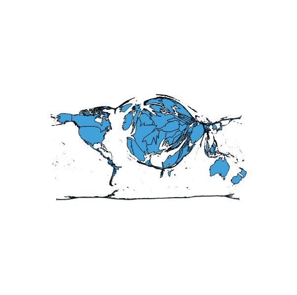
After working around these bugs and massaging my country names to map from .xls to the names in the shapefile (17 cases of “Bolivia (Plurinational State Of)” == “Bolivia”) , I was able to use pyshp to generate a new shapefile with my data in it! Next up, cartogram-orama.

A better simple map

I am learning to use pyshp.py (a pretty buggy but functional python module for reading and writing ESRI shapefiles) and Quantum GIS. As a quick demonstration I replotted the data from an earlier map. Q-GIS makes it pretty easy to adjust the appearance. The world map shapefile is from Natural Earth.

This time I generated a shapefile from python directly, super easy (I will highlight problems with pyshp in a future post, but creating this simple file worked fine, although doesn’t seem to define a CRS, I am pretty sure it is WGS 84). Here is the code:

import shapefile
w = shapefile.Writer(shapefile.POINT)
max_len = max([len(s.name) for s in stations])
w.field(‘NAME’,’C’,’%i’%max_len)
for s in stations:
    w.record(s.name)
    w.point(s.lon, s.lat)

w.save(‘stations’)