Convert a rod pocket curtain to back tabs using only scissors

2012-09-20 12.27.02

Quick Back Tabs from a Rod Pocket

I was looking for a cheap curtain solution for a bunch of windows recently and discovered a simple trick to convert a rod pocket curtain to back tabs.

My quest started with $10 clearance panels — a super bargain! Although not my top choice fabric, at that price (for 6 windows), it was worth it to make it work. Unfortunately the curtains were rod pockets, I hate rod pockets. They don’t slide easily, they don’t bunch out of the way, they look ruffled. I don’t like them. It’s personal preference. But they are only $10 a panel…

I broke out my scissors to experiment with converting the rod pocket to back tabs. I prefer back tab curtains. They fold better out of the way when open and are easier to move (although for this room moving them regularly wasn’t a requirement). Looking at some other panels it seems the tabs should be ~2″ wide and 8″ apart. So I carefully cut tabs into the back side of the rod pocket. On the ends only one cut is needed so the edge of the curtain will hang from the rod. For middle tabs, two vertical snips a couple inches apart centered at 8″ intervals. Note these snips go through the back side of the rod pocket only, so the front of the panel is untouched.

2012-09-20 12.11.08  2012-09-20 12.12.44

Here is the after result with just a few minutes of snips. The before shot shows how the rod pocket looks, the fabric is so stiff that the curtain can’t be pushed all the way to the right (it springs back open). The back tab solution suited my purpose better, with no extra $$ and minimal additional time.

2012-09-20 12.21.37

Before: Rod Pocket — Messy, won’t open fully

2012-09-20 12.25.11

After: Back Tabs — Crisper, open out of the way


LibreOffice auto correct results in JSON.parse() fail on unicode quote characters

Yikes, more character encoding problems! I am trying to format some demo data in a spread sheet for a visualization I am using. I often use the technique of saving an “excel” type document as CSV and then using python to convert the CSV to a JSON file to read in the browser. (Clearly this is a non optimal tool chain, but I usually don’t have the .xlsx file changing and so just run through it once).

Today, however, I attempted to read a JSON object from a cell and ran into interesting trouble. I needed to capture annotations to the data at specific data points, for example at t = 5.2 sec, “car jumped off the ramp”. In the LibreOffice file I have entered something of this format in a cell:

{ “5.2” : ”Car jumped off the ramp!” , ”10.6” : ”Crossed the finish line” }

This looks like valid JSON to me and if I type something similar a JSON evaluator will confirm for me it is valid JSON:

{
   "5.2":"Car jumped off the ramp!",
   "10.6":"Crossed the finish line"
}

However, when parsing this in javascript using JSON.parse() (required because the python csv.DictReader followed by json.dumps() only creates one level deep of a json structure, so these complex cell contents are stored in a string), I got the following message:

Uncaught SyntaxError: Unexpected token “

Humm… does this font reveal to you the possible problem? Looks like a weird quote character and the JSON spec is pretty clear, a plain old double quote is needed.

The file is saved as UTF-8 and printed to the terminal (verified the terminal encoding is also UTF-8 using “echo $LANG”) my quotes now print as “\xe2\x80\x9c” for the first one and “\xe2\x80\x9d” for the subsequent ones, which correspond to the Unicode code points “\u201C” and “\u201D”, also know as “Left Double Quotation Mark” and “Right Double Quotation Mark”. 

I was also able to confirm this by pasting the error message quote character into this online hex converter.

Turns out when editing the cell contents in LibreOffice (to adjust the format to something that *should* be valid JSON) my quotes were being auto corrected. You can disable this “feature” from the menu “Tools >> AutoCorrect Options…” by disabling the Double quotes Replace in the lower right of the dialog as shown below. loffice_auto_correct

In case your source file wasn’t under your control, the following python can be used to replace a unicode character:

# replace Left Double Quote with "
fixedStr = brokenStr.decode('utf-8').replace(u"\u201c', "\"").encode('utf-8');

It also turns out that if you edit your cell contents in a different editor (like emacs) and then paste it in, the auto correction is not applied, which can make debugging a bit more confusing!

Lastly, I found the Unicode confusables site interesting, there are 15 confusable quote characters. So many!

Chunky Puzzle becomes Cute Baby Dresser Knobs

cutest_baby_dresser
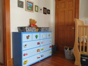
I refinished a dresser for my newest addition and it has received some compliments. The knobs are genius and as far as I know my own “invention”. The process is pretty simple, but it took me a while to get the parts together (namely finding mini wooden dowels to space the puzzle pieces off from the dresser), so I will share my process. Disclaimer: I make no claims as to the child safety of this design, it just seems good enough for me personally (so far!).

Falling in love with the idea

dog_front_zoom 
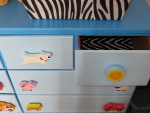
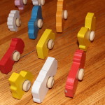
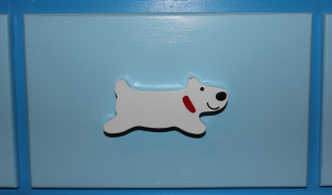
I refinished a dresser in blues for my nursery, but was struggling to find adequately cute hardware. Etsy had lots of hand painted knobs, but the artist in me thought, “I can do that myself…” This thought was tempered by my concern about a new baby eventually trying to eat the knobs and how to finish them appropriately. Then I noticed a used Melissa and Doug Chunky Puzzle that a friend had given us… How cute would these puzzle pieces be as knobs? And how simple as they are already finished and kid safe. Here is a picture of my first prototype knob, which I LOVED! To complete the project now I just needed a safe (enough for me at least) and easy way to turn the puzzle pieces into knobs. This meant something to space them out from the face of the dresser enough to easily grab from behind. The pieces are big enough that you might not really need to get your fingers behind, but it seemed nicer to me than just mounting them flat. So began a search for mini wooden dowels, which was actually the hardest part of this project. Turns out you can buy unfinished wooden toy wheels for crafting! (Although only one of my local Michaels carries them, so it took a while to find).

Turning the Puzzle Pieces into Knobs

For safety reasons I wanted to avoid adding any small loose parts, so step one was to attach the wooden dowel to the back of the puzzle piece with wood glue, which I determined was secure enough for me. If the knob comes off the dresser, I think I would discover the problem before a determined baby was able to detach the wheel from the back and eat it (wood glue is amazing). This was my judgement call, please make it for yourself. Use this design at your own risk.

stencil

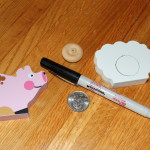
After selecting my puzzle pieces I decided the 1″ diameter toy wheels would be best for my knobs. I used a quarter to trace out the location on the back of the puzzle pieces that I would sand clear of paint. To minimize the visibility of the unfinished wooden wheel I offset the wheel location a bit towards the bottom on the small pieces.


dremel
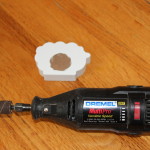
I then used a sanding bit on a Dremel tool to gently remove the paint from the wheel contact area. Of course you could use sand paper, but I found it difficult not to scuff the edges of the puzzle piece and I wanted to keep the painted sides looking good. Be gentle with the Dremel though because side loading it can damage the bearings.

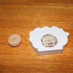
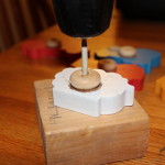
After cleaning the surface, simply glue on the flat side of the wheel with wood glue and wait a day for it to fully cure. Note in the first picture below you can see my wheels had a flat side and a featured side (which will be dealt with below). Observe the securely attached little wheels, already looking like an army of knobs!

wheels glue finishedbacks

drillbitsAfter the glue is cured, it is time to pre-drill pilot holes for your mounting screws. The holes in my dresser fit a #10 screw. The length of screw will vary based on the thickness of your drawer fronts, the wheel width and the thickness of the puzzle piece. I wanted to get as much thread engagement with the puzzle piece as I could (to rely on the glue less to keep things in place), so I spent some time at the hardware store trying to find just the right length for my dresser, in the end it was a 1.5″ sheet metal screw that did the trick.

depth
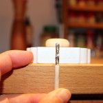
Next pick a drill bit for the pilot hole. If you’re not familiar with this process you can read about how to predrill. Marking the drill bit with tape at the appropriate depth makes it easy to drill deep enough, but not too deep to go through to the front.


depthaction

Drill! Stopping at the tape mark for perfect depth.


For the final cleanup, I used a larger drill bit (pictured above) to effectively debur the hole. The wheels I used were widest at the axle and so they didn’t mount flush. I hit them with my largest drill bit to clear off what was left of that weird feature, so the larger rounded diameter was the part that would press against the dresser front.

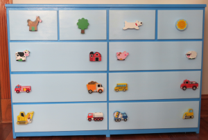
Then the knobs were done and it was time to mount them on the dresser. So cute!
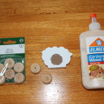
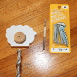
dresser-front

Equipment:

  • Melissa and Doug Chunky Puzzle Pieces, enough cute ones of the right size that you would like, or something similar with finished sides.
  • 1″ diameter Wooden Toy Wheels
  • Screws and Screw driver
  • Drill and bits
  • Wood glue
  • Dremel Tool with sanding bit or sandpaper
  • Tape, a Sharpe and a quarter for measuring

Enjoy!

closeUpOnDresser

Adding labels to the treemap cells

I was expecting the task of adding labels to the treemap to be pretty arduous, but it ended up being simpler than I expected.

Step 1: Determine the size of the label and if it will fit in the box:

This zoomable treemap demo provided an example of how to put labels only on the boxes that are big enough for them. Before looking at this code I wasn’t aware of the svg function .getComputedTextLength(), which tells you how big the text renders. What a life saver, no need to worry about font style or size! In my case, I also needed to know the height of the box, which means I ended up using .getBBox() which gives both the height and the width for a text element (where the width is the same as what is returned by .getComputedTextLength()). The downside of .getBBox() is you have to render the element, you can’t check before creating the label. I am handling this similar to the demo code above, by simply setting the opacity of the text based on whether it fits in the box.

  • First, center the text over the box by setting x, y as the center of the box and using text-anchor:middle
.attr("dy", ".35em")
.attr("text-anchor", "middle")
  • Then set the opacity to 1 if the text fits in the box and 0 otherwise:
.style("opacity", 
    function(d){
       bounds = this.getBBox();
       return((bounds.height < d.h -textMargin) && 
              (bounds.width < d.w-textMargin)    ) ? 1:0;
     })

Now there are labels on everything, but the labels on the small cells are invisible!

Step 2: Fix mouseover so that tooltips and box highlighting continues to work with new text labels

The text over the tree boxes by default grabs the mouse cursor and changes it to a edit icon (this can be seen in the d3 example above). Even more annoying it grabs the mouse events so that the tooltips are virtually impossible to see anymore. Especially since the invisible (opacity 0) labels can be quite long and larger than the cell on small data points. I found an excellent discussion of SVG mouseover by Peter Collingridge. These mouseover issues were cleanly solved by setting the css to “pointer-events: none;”

Step 3: Adjust color of text based on background color

I still haven’t found a good solution for this feature. Ideally as a designer I would want to specify a HSL color threshold to switch between white and black text, however, I don’t think it is possible to get the color value corresponding to this HSL threshold out of the d3.interpoloateHsl(), so I unfortunately have to set the color threshold (using the input units) manually… For example, something like this:

.attr("class", function(d){
    return (d.colorRaw < 0.07) ? "tree-label-dark" : "tree-label-light";
})

where d.colorRaw is the color metric scaled to HSL using the d3 interpolation.

I would much prefer to specify three HSL values, 2 for the range and a third threshold value to switch the label class from “dark” to “light”, but I’m still not sure how to do this. Is there a way to reverse out the number that generates something on the HSL scale? Or compare HSL values?

Note, I love this HSL color picker. Since it provides steps I think it would be very easy to pick a threshold value in the right space…

Final example with working labels:

The labels displayed are simply the raw color data. Notice how the mouse over tooltip is working on a cell with no label.

pinkLabelsCropped

Making the Tree Map more organic (non-uniform column widths) and testing some other data sets

Continuing the work on the Color Prioritized Tree Map, I implemented variable column widths as a step towards making the tree map look more organic. The top picture here is uniform widths for reference and the one below introduced some variable widths, specifically I used a widths multiplier array of [2,3,4,2,5], which is then wrapped to apply a multiplier to the width of each column. This means the second column is 50% wider than the first etc.

variableColWidths

The column widths are assigned before the data is binned, the bin sizes are now equal height instead of equal area. Below is another example. Based on initial testing, the variable widths improve the image best when tweaked and evaluated by eye (since the data set and number of columns also affect the resulting shape). Overall, variable column widths were not as big a gain as I was hoping. Also since the columns are centered on a diagonal, the stepping appearance is retained. I guess introducing variable height would help! But I think the better approach is to look into ragged edges first.

variableColumnWidths

I also tested out a few other data sets, these ones are really lumpy:

lumpy_data

I am still not sure what sort of data will be representative for the target application, but these data sets did stress the viz a bit and demonstrated that the following suspected issues are real:

  • Very small areas erased by a white border: The border is implemented by subtracting a “margin” value from the desired length and width of each element and may result in invisible cells for very small areas. In practice these are so small as to be virtually invisible before, but I modified the code to not apply the white space if it will erase the data point for now.
  • Bad data in the form of missing fields crashes the viz: This is corrected now handled by silently rejecting those data points.
  • Giant elements overflow the column and go off the top of the user provided SVG: Elements with area greater than what should be in a column get put in a column anyway, in which case, the tree map can go off the top of the SVG. It probably makes sense to have some guidelines regarding number of columns based on the size of the largest data and the distribution. A related improvement would be to verify that we aren’t drawing outside the designated box and scaling everything down appropriately if we are to ensure we stay on the user provided SVG.

Tree Data Structure for Color Prioritized Tree Map Project

Continuing the color prioritized treemap project, I built an appropriate tree data structure, where each Node represents either

  • a leaf
  • a group of Nodes (horizontal groups constrained to have the same width and vertical groups to share height)

Important methods include:

  • getArea() which returns the total area for all children
  • createSubGroups() which performs the grouping on this node’s node-group (creating the tree), and
  • flatten() which takes the start coordinates of lower left corner and height or width constraint and recursively flattens the tree, returning a list of boxes with fully defined coordinates appropriate for d3 rendering of the tree map.

To retain the overall organic shape, the highest level is represented as separate columns, each as a vertical node group (if these columns together were considered a horizontal group, the overall shape would be square). I restructured the previous example to use my new data structure. The following screen shot demonstrates that horizontal and vertical grouping is working, as well as the rendering code. As a basic test I simply grouped the first 6 Nodes in the column into a horizontal group:

horizontal_grouping_works

The overall shape here is unchanged from before, you can see that the order of Nodes (defined by the gradient) is retained.

Next up: working on the algorithm for which Nodes to group and how, and thus create a pleasing shape. :)

The following screen shot shows some great improvements and some simplification of the approach too. Now for each column, the elements are grouped into a tree structure, where the smallest area node in a group is paired with the smaller of its neighbors (building a tree of fairly balanced area at each level). Now when flattening the tree, the node groups are assigned either vertical or horizontal orientation based on which will give the better aspect ratio for the sub-groups based on the dimensions of the block being filled. This is the data now with 8 columns:

AdjacentGroup8Cols

It seems to be shaping up nicely, but would be good to fray the edges and vary the column widths to mask the columns better (as Mark Schindler noted, they imply a structure to the data that is not there).

For curiosity’s sake, here is the same data with only one column. What looks kinda like 3 columns here is an artifact of the grouping algorithm (at each level the data is divided in groups), data set and svg aspect ratio:

AdjacentGroup1Col

Now, it’s time to try out a few different data sets and see what other issues shake out.

Creating a color prioritized treemap with GroupVisual.io

I am doing some work now with Mark Schindler of GroupVisual.io. He recently presented at a DataViz meetup about his ideas and motivation for a more intuitive treemap variant. I am going to give a shot at creating it. Here is an example of the color-prioritized treemap concept:

Essentially, this layout abandons the traditional category groupings in a treemap in favor of a more pleasing organization based on the same metric used for color. The other challenges will be creating a pleasing organic shape approximating the hand designed one above. The target is to do this in javascript/d3 for use in web apps.

My first pass approach is to sort the elements based on the color metric, then toss them in bins (columns) of approximately equal area and render it using a stacked bar chart concept using d3:

stacked_bar_v1

It’s a start. Next step, make the columns a bit more equal and fill them on a diagonal, to get a better controlled gradient. In the following screen shot the working area was divided into a grid and filled from the bottom left to the top right on the diagonal. For example, a 3×3 grid is filled in the following order:

4 7 9
2 5 8
1 3 6

Still has the problem that the first column will be full and the last one most likely not, as each preceding column is slightly overfilled.

diagnoal_bins

The following shows a first step at fixing the balance issue, simply centering each column vertically along a slight diagonal for a bit more pleasing shape:

centerOnDiag

That’s it for baby steps, next up: time to work on squaring up these little sliver rectangles and become more “tree” like.

D3 Data Enter and Exit Exploration

I had an interesting conversation recently where I realized that I haven’t actually used the D3 data exit for any of the projects I’ve done with D3 yet. I guess I got away with that so far because either:

I realized that although I have read about enter() and exit() and heard many people lament that they don’t really understand d3, I hadn’t personally investigated very deeply. So I did a little more study…

A good starting point with enter()/exit() seems to be the three little circles demo. Which is a nice illustration of what is happening, but inspecting the code that makes these animations is useless (because it’s not actually using enter and exit directly to demonstrate how they work, it’s not that simple). Also this demo waits till the very end to introduce the compare function associated with the data, which belittles the importance of the compare function for anything more than the simplest enter()/exit(). This is consistent  with all the other demos and code I have written, where no compare function is specified, because lots can be done without ever using exit.

So the question that was posed to me was essentially: “If you enter the data [1 2 3] and then later make the same selection and enter the data [2 3 4], what happens?” Well, my initial answer was that no new elements will be created and the data will be overwritten as [2 3 4], which is absolutely correct. In order for D3 to do something smarter, like exit the now obsolete “1” element and enter a new element with data “4”, you must specify a compare function with the data, as with the “3 little circles” demo, an easy example is to use the built-in “String” function for your comparison, which works well in this trivial example:

    var circles = svg.selectAll("circle")
        .data(data, String); // use "String" as compare function

In order to remove the “exiting” elements you must call exit().remove() as shown here:

    circles.exit().remove();

I looked at the D3 code that runs on enter and exit and frankly it seems like a lot of code and hardly seems worthwhile. In a simple example like this one why you would want to bother to make the comparisons? I guess to animate transitions on exit and enter, or if there was a lot of data and configuration of the elements was costly, but from my testing it seems that all attribute configuration is re-run on all the elements anyway, so I don’t see the practical advantage there yet.

I created a simple page to play with Enter and Exit, it allows you to change the data in the array, toggle the use of a “String” compare and also select if you want to remove the “exiting” elements. It is useful if you want to see what is going on to leave the exiting elements around. It was amusing to me to play with which elements are “exited” and which ones are grabbed again if more nodes are added, particularly the order of things in the DOM which varies if you have a compare function or not. Overall I don’t think there is much utility to this, as it is effectively broken code to see what d3 is doing.

Anyway, if you are interested, check out: Zia’s playground for D3 Enter and Exit testing.

enterExitDemo

Jaybridge Challenge Competition Site Success

The Jaybridge Challenge 2013 is now over and from a technical perspective it went flawlessly. I am pretty thrilled with the performance of the site. The challenge itself was interesting, a well designed problem that allowed a wide range of solutions. The only downside was the small number of contestants. I would estimate 1/50 people who learned about the competition looked at the site and about 1/50 of those signed-up. Of those 1/2 submitted a solution. So for next time, plan on spending more effort on publicity and perhaps time the competition with school holidays of some sort.

Adding Fields to the live database:

During the competition I discovered a bug in my calculation of the leaderboard rank for tied scores (which occurred since the trivial solution generates a repeatable score and pretty much everyone will log that for their first score). Instead of using the submission time to differentiate the leader in case of a tie, I was using the user’s signup time. During beta testing, users signed up and then got a trivial solution in a short time, so the sorting appeared to work fine. When I noticed the bug during the competition, I realized is should have been tracking the submission time along with the submission id and score in the best score database. Making this change on the live site required adding some fields to the database, which was a bit scary, since I hadn’t tried something like this before. (In retrospect, I would say that it’s pretty similar to lots of backwards compatibility things I’ve done in the embedded world. I like when that stuff translates.)

Code Steps:

  1. Add new field to the entity constructor
  2. Write a function to “massage the db”, adding in values for the new field to entries that don’t have it and create a handler from some url to trigger this massage.
  3. Update the leaderboard code to use the new database field.

Test Deployment Steps:

I tested the changes as I went on my development server and all seemed to be going well. I then deployed the change on our beta-test site and discovered several problems (the first 2 related to the initial default values not apparent on development server tests):

  1. Corner case of best_score == 0 wasn’t handled correctly (because in my test submissions I hadn’t realized this was a valid score.)
  2. Invalid submission id’s not checked for.
  3. The leadboard queries stopped working for a time, while the new database indexes were building, making the site nonfunctional for a few minutes, which I deemed unacceptable.

Live Competition Site Deployment:

Based on the test site deployment, I fixed the 2 bugs and then broke the deployment down into a few steps as follows.

  1. Deploy to the live site the changes to the db constructor and the massage functionality only.
  2. Hit the “massage db” url, so that all new data in the db is populated and wait a bit for indexes to be created.
  3. Deploy the change to the leaderboard to use the new database information.

And wallah! Flawless deployment, I was pretty grateful to have the extra layer of testing provided by our beta-test site. It was definitely kinda scary to risk a change like this while the competition was live, but it went very well and I learned something about making db changes like this, enough to get this job done.

A note on cost:

Regarding the operating cost/optimization/developer time trade-offs it was interesting to see the challenge didn’t get enough interest to run up any significant costs. We did accrue ~10 cents of database queries beyond the free quota. I definitely hadn’t anticipated the number of submissions that some contestants would make. Some appeared not to be doing any basic validation on their submissions locally (I suppose some didn’t have Ubuntu VMs to test on and didn’t think to set them up), which meant for one Java user ~90 submissions which failed to execute in some way before getting a score. One team used some randomness in their algorithm and so would submit the same entry multiple times for different scores, with nearly 250 submissions in total. I wasn’t caching the table of each users submissions, even if I had I probably wouldn’t have thought initially to incrementally update the cached value and minimize the big queries, since it hadn’t occurred to me that any single user would make so many submissions, certainly none of our beta testers did. :) Here are screenshots of the submission history for the users mentioned above (scores anonymized):

hardcore

randomness

In the end not spending time optimizing was of course the right thing, since none of that was needed. Also I would have guessed wrong about where the high use was going to be.