Positioning a tooltip above a rectangular SVG path

Recently I was working with a shapefile dividing the state of MA into rectangular grids. I wanted to position the tooltip relative to a rectangluar svg path on a Leaflet map overlay. Usually when I want to provide info on a path it is a data line and I place the tooltip based on the mouse coordinates, as discussed in my previous post about tooltips. In this case, I wanted to place it centered over the data, where the highlighted region below is an SVG “path”, and not a “rect” element:

arlingtonTooltip

It turns out the path description is pretty simple for a rectangle. In geoJSON the rectangle geometry element is one shape (geometry.coordinates[0]). The rectangle is encoded with 5 data points, where the first and last are the same, as show in the screen capture below:

geojsonRect

The GeoJSON coordinates here are WGS84.

Inspecting the DOM for one of these paths after rendering shows that the SVG path has only the required 4 data points and is closed by the “Z”. Here the values are SVG coordinates.

<path d="M293,160L222,160L222,89L293,89Z"></path>

I wrote the following function to calculate the top center position of the rectangle, for the purpose of positioning the tooltip.

// locates the top center SVG coordinates for a rectangular GeoJSON feature
function getRectangularPathTopCenterPosition(d){
    // Use 1st and 3rd data point to get bounds of rectangle
    pointA = d.geometry.coordinates[0][0];
    pointB = d.geometry.coordinates[0][2];

    // convert from coordinate system to SVG coordinates
    var point1 = map.latLngToLayerPoint(
        new L.LatLng(pointA[1], pointA[0])); 
    var point2 = map.latLngToLayerPoint(
        new L.LatLng(pointB[1], pointB[0])); 

    // get middle x value and min y value
    var x_pos = (point1.x + point2.x)/2;
    var y_pos = Math.min(point1.y, point2.y);

    // get the offset of the map on the page, 
    // using the overlay we are drawing on
    var mapOffsets = $(map.getPanes().overlayPane).offset();

    return {"x": x_pos + mapOffsets.left, 
            "y": y_pos + mapOffsets.top};
}

In the end I didn’t like the tooltip moving all over the screen and obstructing the map, so I used a statically positioned data table that updated on mouseover. Even though I didn’t use it, the approach above was so much better than positioning based on the mouse and obstructing the region of interest that I thought I’d share it anyway.

Visualization submitted for 37 Billion Mile Challenge

Update: We won the category Best Analysis!

BestAnaylsis37

Together with Paul Schimek and Kim Ducharme, I submitted an entry for the 37 Billion Mile Data Challenge. MAPC made available transit data on MA driving from the DOT from 2008 – 2012. They also divided the state into ~15 acre grid cells (250mx250m), for which they provided information on driving, estimated C02 emissions, land use metrics, school accessibility, population from the 2010 census. I created an interactive map to explore this data statewide aggregated at the zip code level and also at the 15 acre grid cell level. Paul ran a multivariate regression model to explore possible explanatory variables independent of other effects. Kim provided excellent styling assistance as always.

The map is amazingly interesting to explore: down to the neighborhood level you can explore population density, average income, jobs, transit access, miles driven per day per person and more.  Check out the live version to explore the interactive map.

entry-thumbnail

If you are interested you can take a look at the other submissions for the challenge and vote for your favorites.

d3 compare function gottchas, don’t try to use any information not bound with your data!

I ran into an interesting problem updating a legend rendered with d3 today. I am displaying different data sets on a map and adjusting the colors and cutoff values based on what variable is selected. The image below shows two example states of the legend, the third is the unexpected result when I transition from the first to the second and the “200-300″ case fails to update.

LegendUpdateFail

My data for the legend was structured as a list of lists:

var legendStrings = [
    [" < 25", "25 - 50", "50 - 100", "100 - 150", "150 - 200", 
     "200 - 300", "300 - 400", "400 - 500", "   > 500"],
    [" < 10", "10 - 50", "50 - 75", "75 - 100", "100 - 200", 
     "200 - 300", "300 - 500", "500 - 1000", "   > 1000"] 
];

In the legend update function I selected the appropriate legend string list from “legendStrings” based on the index of the data being displayed and attempted to create an appropriate compare function as discussed previously. However, this failed as shown in the picture above:

function updateLegend(ind /* index of variable being plotted */){

    var lstr = legendStrings[ind];
    var rects = legend.selectAll("rect")
         .data(lstr, 
              /* this compare function doesn't work, 
                 using "ind" here will have no effect. */
              function(d, i){ return d + ind*10 + i;});

    /* do the rest of the work to render rects, text, etc */
    /* then don't forget to remove exiting elements */
    rects.exit().remove();
}

My not so clever compare function included the index of the data, “ind”, so I thought it would enter new elements whenever the index was changed. However, this doesn’t work, because the compare function used is not bound to the data. So when update is run, the new compare function is used to compare the old data with the new data and the old compare function doesn’t exist anymore… The solution is to only use the attributes of your data (stored in d, and i) in the compare function, so in this case refactor the data representation so that it includes information about which variable is being stored. Or, you can always delete the elements and re-render them:

legend.selectAll("rect").remove(); 
/* then render new elements as above */

Which seems about the same to me in this case and was certainly a lot simpler. I guess I am still waiting to see the use case where I get excited about the d3 enter and exit functionality…

Pretty Simple Tooltip

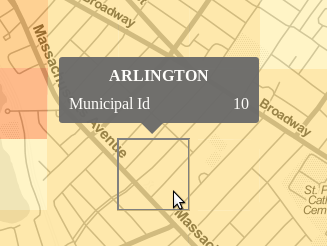
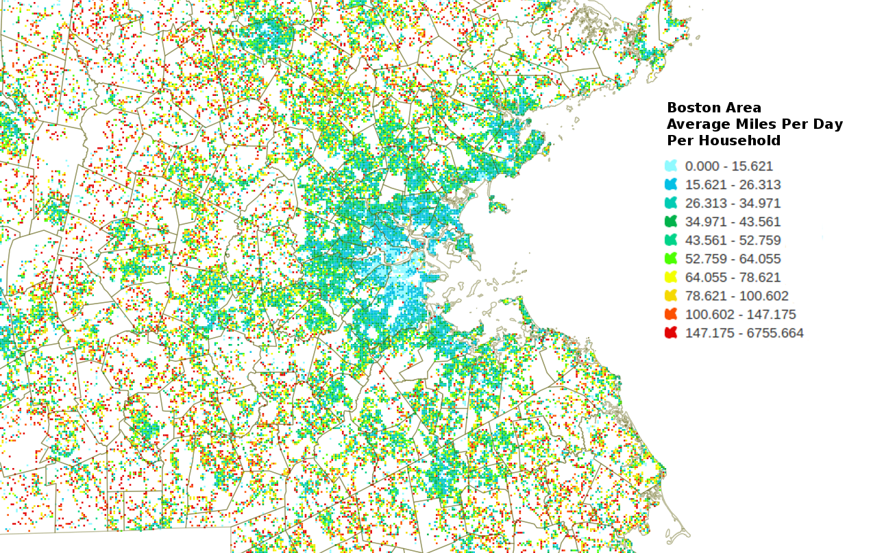
I decided to document the tooltip approach I’ve used on some recent projects. Basically a combination of the styling approach as seen in the New York Times article: Four Ways to Slice Obama’s 2013 Budget Proposal (this is a wonderful visualization I’ve studied a lot) and David Walsh’s css triangles trick for the call out triangle. It is a common enough need to have a tooltip with some styling and a nice indicator arrow pointing at my data, something like this:

arlingtonTooltip

HTML

First, define the div structure for the tooltip and classes to be used, with some text for testing the layout. It helps to have a high level container for positioning and then individual classes to format different fields. In this example I used a couple of spans to have left and right justified text for the data display. I usually just put the tooltip div in the body in html (rather than generate it programmatically):

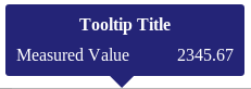
<div id ="tooltipContainer">
  <div class="tooltipTitle">Tooltip Title</div>
  <div class="tooltipContentsContainer">
    <div class="tooltipMetricContainer"> 
      <span class="tooltipMetricName">Measured Value</span>
      <span class="tooltipMetricValue">2345.67</span>
    </div>
  </div>
  <div class="tooltipTail-down"></div>
</div>

CSS

Next up, style the tooltip! I usually set the #tooltipContainer to “display: block” when testing so I can see how the tooltip renders with the dummy data. I often use crazy colors to debug as well (it can be helpful to see exactly where the triangle div overlaps the main part of the tooltip for example). Here is the css used to generate the example tooltip above:

/* Overall container for the tooltip */
#tooltipContainer{
    position: absolute;
    display: block;
    background: midnightblue;
    color: white;
    border-radius: 3px;
    padding: 10px;
    width: 200px;
    opacity: 0.95;
}
.tooltipTitle{
    font-weight: bold;
    text-align: center;
    margin-bottom: 10px;
}
.tooltipMetricName{
    float: left;
}
.tooltipMetricValue{
    float: right;
}
.tooltipTail-down{
    /* position down arrow relative to the #tooltipContainer */
    position: absolute;
    bottom: -11px;
    left: 95px;

    /* Render a triangle of ccs pointing down as discussed here:
       http://davidwalsh.name/css-triangles */
    width: 0; 
    height: 0; 
    border-right: 12px solid transparent;  /* left arrow slant */
    border-left: 12px solid transparent; /* right arrow slant */
    border-top: 12px solid midnightblue; /* bottom, add background color here */
    font-size: 0;
    line-height: 0;
}

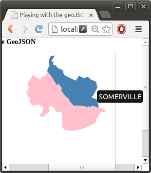
Now you should have something like this rendering on your page:

SimplerTooltip

Javascript

Now that you have a dummy tooltip rendering, it is time to make it interactive using javascript to accomplish the following:

  1. Control display of the tooltip (togging display between “none” and “block”, or fade in using transitions on opacity),
  2. Populate data values for the different fields you are displaying, and
  3. Position the tooltip (relative to the cursor or positioned over an svg element)

Positioning relative to the cursor

Here are the relevant bits of code (note I am using d3 and jquery), positioning the tooltip relative to the cursor.

// store reference to tooltip to avoid looking it up all the time
var simpleTooltip = d3.selectAll("#tooltipContainer")
    .style("opacity", 0); // hide it since we are done testing now

// define a function to update the tooltip
function updateTooltip(d, displayRequested){

    if(!displayRequested){
        // hide the tooltip
        simpleTooltip.style("opacity", 0); // #1 hide on mouseout
    }else{ // show the tooltip

        // #2 Populate display based on input data (d)
        // set the data to display for each field of the tooltip
        simpleTooltip
            .select(".tooltipTitle").text(d.properties.municipal);

        var mc = simpleTooltip.selectAll(".tooltipMetricContainer");
        mc.select(".tooltipMetricName").text("Municipal Id");
        mc.select(".tooltipMetricValue").text(d.properties.muni_id);

        // #3 Position the Tooltip, here relative to the mouse
        // get the tooltip dimensions dynamically if the size could change
        var h = $("#tooltipContainer").height();
        var w = $("#tooltipContainer").width();

        // center the tail dynamically
        simpleTooltip.select(".tooltipTail-down")
            .style("left", (w/2 - 29/2) + "px");

        // position with respect to mouse on mouseover
        var offsets = {"x": d3.event.pageX, "y": d3.event.pageY };
        simpleTooltip 
            .style("left", ( offsets.x - w/2) + "px")     
            .style("top",  ( offsets.y - h -36) + "px"); // fudge factor 36

        // #1 Display the updated tooltip
        simpleTooltip.style("opacity", 0.95);      
    }
}

// add mouse event listeners to your features, which call the update function
features
    .on("mouseover", function(d){
        updateTooltip(d, true);
    })
    .on("mouseout", function(d){
        updateTooltip(d, false);
    });

Positioning the tooltip with Javascript relative to SVG element

There are two cases I’ve used for positioning the tooltip, either using page coordinates, or svg coordinates. The former, shown above,  is best for adding a tooltip on a path (for example a data line), where you want the tooltip to be where the mouse is mousing over the line. The latter approach (svg coordinates), is best when you want to position the tooltip relative to the element you are mousing over, for example, directly above or to the right of an svg:circle.

In the case of an svg circle for example, you can add an argument to pass the element into the update function and calculate the offset coordinates as follows, NOTE in this case the tooltip div is declared inside the SVG (is that crazy, whatever, it works):

function getOffsetsForSVGCircleOrRect(el){
    var h = $("#dataTooltip").height();
    var w = $("#dataTooltip").width();

    if(el.attr("cx")){
        // it is a circle data point
        var xpos = Number(el.attr('cx'))+margin.left;
        var ypos = Number(el.attr('cy'))+margin.top + Number(el.attr('r'));
    }else{
        // assume it is a rectangle
        var h = Number(el.attr("height"));
	var w = Number(el.attr("width"));
        var xpos = Number(el.attr('x')) + w/2 + margin.left;
        var ypos = Number(el.attr('y')) + h   + margin.top;
    }
    return {"x":xpos, "y": ypos};
}

// update function for some circles, which passes the element (d3.select(this))
points.enter().append("svg:circle")
    .attr("class", "point")
    .attr("r", 10)
    .attr("cx", dx)
    .attr("cy", dy)
    .attr("fill", getColor)
    .on("mouseover", function(d){ enableDataTooltip(d, d3.select(this), true); })
    .on("mouseout",  function(d){ enableDataTooltip(d, null, false); })

That’s the idea anyway. There are so many ways to approach tooltips. I just wanted to share what is working for me at the moment. This approach works well if you don’t want a drop shadow on the tooltip, if you want a border of some sort, then you can use an image instead of the css triangle as was done in the NYT article mentioned above.

Boston is a weirdly shaped town

I am looking into using d3 in conjunction with Leaflet and worked through Mike Bostock’s tutorial on d3 and leaflet. Using the MAPC provided shapefile for municipalities, so far it seems really slow on zoom, I think because of the super high resolution shapes being recalculated. Check out the shape of Boston!

boston

Can I just say that Boston is genuinely a weird shaped town? I particularly love these oddities:

  1. The tiny sliver in of Boston that extends into Everett!
  2. A small section of the airport is in Winthrop
  3. The tail end of Winthrop peninsula is in Boston
  4. Brookline. Need I say more…

CRS support in GeoJSON, QGIS and pyshp is not awesome

I was having some trouble visualizing the geoJSON files I generated in the previous post in d3. Does this look like Somerville in blue to you? No?! Well obviously the pink is Cambridge though…

wrongProjection

Turns out the problem was the wrong projection. The MAPC data (or most of it) is using the NAD83(HARN)/Masssachusetts Mainland EPSG:2805 (QGIS reports this), also known as,  “NAD_1983_StatePlane_Massachusetts_Mainland_FIPS_2001″ from the .prj in the shape file.

Apparently, pyshp doesn’t handle reading the .prj files very well, it kinda ignores them on purpose (https://code.google.com/p/pyshp/issues/detail?id=3). So using pyshp to convert the shapfiles to GeoJSON probably wasn’t a good choice (no projection info will be transferred to the GeoJSON).

GeoJSON allows for specifying a CRS, but assumes use of the default of WGS84 if none is specified according to the spec. I tried to explicitly set the CRS in the geoJSON, but that doesn’t seem to be working, it looks like the d3 code is ignoring the “crs” property and assuming WGS84 as well.

I then tried saving the layer as GeoJSON with QGIS (version 1.7.5), despite the very nice save dialog and carefully selecting the desired projection, it doesn’t work at all:

  1. The GeoJSON was not reprojected to the desired coordinate system (pretty similar to this reported QGIS issue), and
  2. QGIS does not populate the crs property in the output GeoJSON

However, saving the layer as an ESRI shapefile you can change the projection using QGIS.

I was able to use ogr2ogr to convert the GeoJSON generated by pyshp with no CRS specified to WGS84 (“EPSG:4326″), after which it renders correctly in d3. (Note when I tried different target projections there was still no crs property in the GeoJSON! It looks like support for different crs in GeoJSON is pretty spotty). Here is the ogr2ogr command I used for the simple projection change:

ogr2ogr -f "GeoJSON" -t_srs "EPGS:4326" -s_srs "EPGS:2805" new.geojson old.geojson

And now you might recognize these Boston suburbs:

somerville

At this point really what is the point of using any tool other than ogr2ogr? For example, the following command converts the Massachusetts municipalities shape file to GeoJSON, reprojects it correctly, and filters out all the cities except cambridge and somerville.

ogr2ogr -f "GeoJSON" -t_srs "EPSG:4326" \
        -where "municipal IN ('CAMBRIDGE','SOMERVILLE')" \
        camberville.geojson \
        ma_municipalities.shp

All in one command and it does it correctly (although ogr2ogr doesn’t seem to put crs info in the geojson either, so I’d stick with WGS84 as much as possible).

37Bill Grid data — average miles traveled per day per household

MAPC provided a shape file dividing the state on a 250m grid (~15 acre blocks). The file is pretty unwieldy, dividing the state into 355,728 segments, for which only 67,919 have data (less than 20% of the grids have a metric for “mipdaybest” which I used to filter the data). Here is a picture of the state with only the grids with data colored:

PopData

To accomplish this rudimentary image I converted the provided shape file to GeoJSON in python using the pyshp library, filtering out records with no data.  This code is based on an example by M. Laloux, modified to use an iterator over the records and drop any with no data (here I am using “mipday_phh” as a proxy for no data).

import shapefile
import itertools
import sys
sourceName = sys.argv[1] #"../data/grid_250m_attr.shp"
destName = sys.argv[2]   #"data/grid_250m_attr_removedEmpty.json"

# read the shapefile
reader = shapefile.Reader(sourceName)
fields = reader.fields[1:]
field_names = [field[0] for field in fields]

mipday_phh = field_names.index("mipday_phh")

buffer = []

for (sr, ss) in itertools.izip(reader.iterRecords(), reader.iterShapes()):

    if sr[mipday_phh] == 0.0:
        #print "skipping", sr
        continue
    atr = dict(zip(field_names, sr))
    geom = ss.__geo_interface__
    buffer.append(dict(type="Feature", geometry=geom, properties=atr)) 

    # write the GeoJSON file
from json import dumps
geojson = open(destName, "w")
geojson.write(dumps({"type": "FeatureCollection","features": buffer}, indent=2) + "\n")
geojson.close()

I then opened the file in QGIS (Why did I convert it to GeoJSON you ask? Because I am planning to work with it in d3 next). With QGIS I can’t see the grid color by default because it is overwhelmed by the default black border on each shape. This post discusses how to remove the outline. I ended up using the last option (the old Symbology), but what a pain!

Besides the difficulty of working with such large files (did I mention with all the yak shaving I am doing here I got a bigger hard drive too?). The grid data is also awkward to link to other data sets, which more typically use zip code information. (Update: The companion data set Tabular section includes zip code information for the centroid of each grid cell). Since the grids are regular, many span multiple zip codes/municipalities. Furthermore, addresses were mapped to grid locations based on estimates of street location, so for some rural areas some data was mapped to the wrong grids etc. Regardless of those challenges, the pictures below show clearly that driving patterns vary greatly within a city or zip code.

Here are a few plots looking at the data in QGIS showing Miles Per Day per Household, where the blues are under 35 miles per day, yellow around 75 and orange is over 100 miles per day. It’s a horrible viz, but I can’t bring myself to spend time on the color config in QGIS (way too painful). Note the municipality boundaries shown are drawn from a separate shapefile layer provided by MAPC.

mipd_phh

The same image is shown below zoomed in on the Boston area. There are unsurprising large swaths of long distance car commuter communities ringing the city. I included a legend here FWIW, the colors were picked manually from the QGIS color picker (which leaves a bit to be desired), hence the abysmal scheme. The divisions were automatic using the equal bin option. This data is clearly flawed! We can see from the legend that there is at least one grid cell with an average of over 6 thousand miles a day! I screen grabbed this legend from the layers toolbar in QGIS and gimp-shopped it in for your viewing pleasure.

MilesPerDayPerHouseholdBostonArea

Next up, working on a workflow for rendering nice images and figuring out what data and stories to tell.

Data used in this post was provided by Vehicle Census of Massachusetts, Metropolitan Area Planning Council 2014 and licensed under a Creative Commons Attribution 4.0 License.

Deloreans of Massachusetts 2008-2011

MAPC and the Mass DOT recently released data from the Vehicle Census of Massachusetts for use in the 37 Billion Mile Data Challenge. I am just warming up with the data, so I thought I’d take a look at some simple questions. I’d love to look at something of personal interest, like MIT solar cars (back in 1999 we registered our three wheeled flying saucer as an “experimental motorcycle”) or the Solectria Force (since I wrote software for the Force when I was working at Azure Dynamics). Unfortunately, these vehicles are among the thousands in the dataset that have no manufacturer information because they were not part of the commercial database used to decode VINs on the dataset. Although, to be fair, there are over 230 different makes identified. Besides the solar car didn’t even have an odometer. :)

So how about investigating the Deloreans of Massachusetts? Have you ever seen one on the road? I saw one in Cambridge some years back… I wonder what the story behind it was. Did you know they made gold plated Deloreans? Pretty cool, but according to Wikipedia the remaining ones are all in museums.

foobar

1981 24 karat gold plated DeLorean. William F Harrah Foundation National Automobile Museum in Reno, Nevada. Photo via WikiMedia released under a GNU Free Documentation License.

There were 20 Deloreans registered in the state of Massachusetts between 2008 and 2011. According to Wikipedia there are approximately 6,500 vehicles still existing. Which means MA accounts for ~0.3% of the surviving Deloreans. Of these, 12 were manufactured in 1981, 7 in 1982 and 1 in 1983.

I posit that most of these vehicles are being happily garaged and protected from the elements. Not unexpectedly, they are all relatively low mileage vehicles for 30+ year old cars.

Delorean_od

MAPC provided daily mileage averages based on odometer readings reported at inspection stations. They also did a lot of work cleaning the data and anonymizing it so we can’t track down specific owners of vehicles (at least they tried). Looking at the calculated daily mileage I immediately suspect two outliers:

  • One data point, where the data is starting from 2007 and there is only one odometer reading for that vehicle of 40350, which seems have been credited entirely to the 403 day period between inspections, resulting in an outrageous 102.69 mile per day average.
  • In another case it looks like the ten-thousandths place was mis-entered by the inspection station (can’t really blame them, they are inspecting a Delorean afterall). So an extra 30,000 miles is being credited for a 394 day period (which accounts for 76.14 of the average daily miles reported). Correcting for this error brings the miles down to a reasonable 0.89 miles/day.

It was interesting when looking at the average daily miles to note that of the 64 records for these 20 vehicles, 25 have unavailable odometer data and therefore report a daily mileage of zero. Another two had the obvious errors discussed above. Who knows what the fidelity of the rest are or how this reflects the total data set. Clearly the data isn’t perfect, but the image below seems to indicate there are a few people regularly driving their Deloreans.

After discarding data as discussed above, I plotted the average daily mileage and the days between inspections used to calculate the average for the remaining records (37 of them). I colored data points for a few vehicles that seemed to show consistent behavior. You can see a common inspection interval around 400 days (Delorean drivers push their inspections to the end of the month+ just like the rest of us). The consistency between years for many of the “higher” average mileage vehicles indicates those numbers are real and there are probably a half dozen or more Deloreans doing a daily commute in Massachusetts!

A few vehicle's data is colored to show consistent behavior in the data. It looks like a few Deloreans in the state are used for a daily commute.

A few vehicle’s data is colored to show consistent average daily mileage and regular inspections for those vehicles. It looks like a few Deloreans in the state were used pretty regularly from 2008 – 2011.

A few closing thoughts on my first dive into the data. Ugh, I forgot how painful matplotlib is to make anything pretty, so I didn’t bother here! I tried out IPython Notebook a little bit, but I don’t think I can handle editing code in the browser. Pandas? Not ready to pass judgement, but I didn’t have the patience to figure out if it could do what I wanted today… I did use it to generate the following stats on the average miles per day data above:

delorean stats

More than half of the data points are doing less than 2 miles per day of driving, but hey, my car sits about that much too.

Data used in this post was provided by Vehicle Census of Massachusetts, Metropolitan Area Planning Council 2014 and licensed under a Creative Commons Attribution 4.0 License.

Animate a line draw in d3 using transitions on stroke-dash properties

Do you want to animate a line so that it looks like it is being drawn on the screen?

At a first pass you might think this would be difficult, for example requiring you to draw in the path piecemeal like this: https://groups.google.com/forum/#!topic/d3-js/pWOfEThcnIg Ugh!

However it turns out it is trivial if you use the svg stroke properties: stroke-dasharray and stroke-dashoffset as demonstrated in this bl.ock and discussed below. The trick is to understand how the dasharray and dashoffset work.  The dasharray is a list of lengths that specify alternating dashes and gaps, starting with a filled section (you can create all sorts of dash-dot patterns). The offset shifts the pattern start point to the left. Here is a quick example I drew in Inkscape, as an experiment in exploring SVG through an SVG drawing program. I was disappointed that the concepts here are abstracted away by the GUI (might as well be drawing it in Word), but by inspecting the output svg file I was able to determine the values being used in the image below for the stroke-dasharray are “48,48” and the stroke-dashoffsets are “24” and “48”. For this example only the ratios are relevant.

lineExample

Now, in order to use these properties to animate a line draw:

  1. Calculate the length of the rendered line (or bigger works too for this example), call it lineLen for this example.
  2. Initialize the line with a stroke-dasharray of “lineLen, lineLen”, so the filled dash and the gap are each greater than or equal to the length of the line.
  3. Initialize the stroke-dashoffset to “lineLen” so that the pattern will start with a gap (your line will start invisible).
  4. Transition the stroke-dashoffset to zero, this will cause the pattern to shift to the right, revealing your line from the left to the right (moving from the bottom up in the example above).

Here is the key bit of code, assuming you know some d3 and have some “data” and a “line” defined for it.

   var path = svg.selectAll("path")
        .data(data)
        .enter()
        .append("path")
        .attr("d", line)
        .attr("fill", "none");

   var lineLen = path.node().getTotalLength(); // 1. get length

   path.attr("stroke-dasharray", // 2. pattern big enough to hide line
                   lineLen + ", "+lineLen) 
        .attr("stroke-dashoffset",lineLen); // 3. start with gap
   path.transition()
        .duration(2000)
        .attr("stroke-dashoffset", 0); // 4. shift pattern to reveal

Here is a bl.ock playing around with an absurd progress bar concept (not really), but having fun with other dasharray patterns: http://bl.ocks.org/zsobhani/9236015

I used this trick to draw a line on the screen as an enter animation on recent project and loved the simplicity of the solution.